Tag Archives: social network

Facebook Timeline now available worldwide

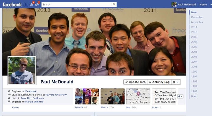
Mark Zuckerberg announced his social network’s redesigned profile page dubbed Timeline back in September at F8, Facebook’s developer conference. Just shy of three months later and Timeline is out of beta and now available worldwide for Facebook users to see and interact with. The new look is fully detailed at this previous post, and there are a few new things you should know about concerning the rollout of Timeline. Facebook is giving users a 7-day review period once Timeline is activated on an account. This means that you’ll have seven days to review everything that appears on your timeline before anyone else can see it. During this time you can feature and hide stories from your past and get your profile page looking just the way you want it before all your friends view it. Once your Timeline is ready, you can terminate the review period and publish your profile page manually; or you can simply let the week pass and it’ll automatically publish. Timeline is currently rolling out to all Facebook users. If you haven’t received the update yet and want it now, head over to Facebook’s “Introducing Timeline” site and click the Get Timeline button. The redesign is also available to view at m.facebook.com and on the Facebook app for Android. There is no ETA for when the update will reach iOS devices.

Update: That was quick. Facebook just rolled out a new version of the Facebook app for iOS devices (v4.1) and it brings the Timeline experience to iPhones and iPod touches. Timeline support for iPads is still listed as “coming soon.” Note that you will only see Timelines on your mobile device(s) if the feature has already been enabled on the desktop browser-based Facebook. The update also brings access to subscribers and subscriptions and performance improvements.

[Via Facebook]

Twitter gets a new look, again

On Thursday Twitter announced that it’s rolling out another new look for its homepage. This time around, the desktop and mobile experiences are getting simpler and streamlined. (New) New Twitter is organized into four sections: Home, Connect, Discover, and Me. Let’s take a brief tour…

Home is home to your personal collection of tweets. The desktop version is organized into two columns. To the left there’s your personal info including your name, profile picture, your number of tweets, who you’re following, and your followers; there’s also a link to your profile page and a way to quickly compose and send out a tweet. Underneath that you’ll find follower suggestions and the trending topics list. To the right there’s the familiar list of incoming tweets from the people you follow. The new interface allows tweets that are attached with images and videos to expand so you can easily explore embedded media. Replying, retweeting, and favoriting tweets are all just one hover and click away.

Connect acts as a hub very much like the Activity Feed of the old Twitter. It’s the place where you’ll see who has followed or mentioned you, retweeted or favorited one of your tweets. Tweets are organized by Interactions and Mentions. A search bar sits at the top and you can use it to find and discover people by entering their @username or full name.

Discover highlights trending topics and stories that are being talked about on the social network. This section is organized like this: Stories, Activity, Who to follow, Find friends, and Browse categories. Stories that are shown to you are based on recent popularity as well as your connections, location and language. Activity shows everything your connections do related to the accounts that they follow. See who else your connections follow, their lists and what Tweets they favorite, retweet or reply to most. In Discover the search bar at the top allows you to enter a hashtag or keyword to further explore a topic of your choice.

Me servers as your profile page and it can be fully customized from here. A gallery of your recently tweeted photos and videos are stored here, as are your Direct Messages.

The new Twitter design is the network’s most simplistic to date, and best of all it transfers over to the mobile space too. Whether you’re accessing Twitter from a desktop or your cell phone the experience will be nearly identical. How do you enable the new look? Easy! Download and login to the latest versions of Twitter on your iPhone or Android device and then you should be able to access the new desktop version. Twitter says they’re working on rolling it out to all users “over the next few weeks.”

[Via Twitter 1, 2]

Google+ gets trending topics, among other additions

Updating Google TV just wasn’t enough for the G-Men. Around the same time Google announced the forthcoming GTV updates, they flipped a switch and introduced four additions to their social network project known as Google+. First, they’ve stolen a page out of Twitter’s playbook and Paris Hilton’s vocabulary to come up with a “What’s Hot” trending topics section. Users can now search and view the most popular items being shared on the network. Next, Google is giving users the opportunity to watch shared content spread across the social network with Google+ Ripples. Described as a “visualization tool for public shares and comments,”  Ripple will allow users to zoom in on shared events and identify top contributors. If this “experimental” feature sounds interesting to you, give it a spin! The Google+ Creative Kit has been added to the Photos section of the site. The kit provides users with more ways to edit and personalize uploaded photos. Last, the company has announced that Google+ is now available to all Google Apps customers worldwide. Read more about it at Google’s Enterprise blog. All of the new updates described here have already rolled out to users, so if you’ve got an account check ’em out. Video after the break.

Update (11/3): Today Google baked YouTube functionality inside Google+. Login to your Google+ account and you’ll find a new YouTube icon hanging out in at the top right of the screen. When you wave your cursor over it, it’ll expand and ask you “What would you like to play?” Enter a query and Google will automatically play a related video and generate a playlist of related videos in a separate window. You can easily share YouTube videos with your friends on the network, and they in turn can open a related playlist directly from your post. Also, YouTube playlists will now reveal themselves in Google+ search results.

Update (11/7): And the Google+ updates keep on coming. Today Google rolled out Google+ Pages worldwide. In simplest terms, Pages are profiles for businesses and brands. They look and function almost exactly like individual profiles. A shiny badge is plastered on Pages to distinguish them from regular users. Beyond that, sharing information, circle relationships, Hangouts–it’s all the same. Pages will now show up in Google+ search results. Additionally, Pages will show up in standard Google search results when you add the “+” before your query. For example, when you type “+Pepsi” in Google and hit enter, you will instantly be taken to Pepsi’s Google+ Page. Google’s calling this Direct Connect. Watch it in action after the break, then give it a go on your own.

[Via GoogleBlog 1, 2, 3] Continue reading Google+ gets trending topics, among other additions

Facebook redesigns profile pages with Timeline, partners with app developers to make things more social

Hot off the heels of updating the News Feed and adding the Ticker, Facebook’s Mark Zuckerberg announced more changes coming to the social network at today’s F8 developer conference.

Timeline

Your profile page is about to undergo an extreme makeover. The page is becoming wider to offer up more content at a glance and it will house three distinct sections: Cover, Stories, and Apps. Your Cover is dominated by an enlarged image, something that is separate from your profile picture and better expresses who you are. Your Cover can be personalized at any time and with any image you uploaded to Facebook. This section of the profile also shows off your About info (where you live, where you went to school, your job, your relationship status, etc.) and it also gives your friends a quick glance at your total number of friends, photos, likes, etc. Directly below that section is your Stories; this is an enhanced version of your Wall and it’s defined by an integrated Timeline. The Timeline makes it easier to highlight and go back to older posts. Up until the introduction of this new interface, the only way to see go back and see post from the past is to scroll all the way down to the bottom of your profile page and click “Older posts.” Users are forced to keep clicking that link to dig into the past. With Timeline, the past is easier to rediscover with the ability to highlight past memories that you don’t want people to forget happened so fast. All the content you ever posted on Facebook can be scrubbed through by date (month, year). And the Timeline is totally customizable; you can go back to a particular date and add events and pictures that you might have forgotten to post at the time they occurred. You can mark (or “star”) your favorite stories and these will expand to widescreen so your friends can see them more clearly. You can also remove the stories you want to hide. In addition to your Stories, the Timeline section of your profile page will also highlight apps.

Social apps

Facebook has offered apps in the past, but never like this. Zuckerberg and company have teamed with more than a handful of third-party developers to make apps more social on Facebook. Here’s an example: You’re an avid user of the new music streaming service Spotify and you’ve connected your Facebook account to your Spotify account. Since you’ve been using Spotify when it launched earlier this summer in the US, you’ve been listening to tunes and sharing what kind of music you listen to with your friends over Facebook. Today Facebook is bringing the listening and sharing experience to a whole new level. When you tell Spotify to share your listening habits to your Facebook friends, not only will they see what you are listening to but they’ll also be able to play the song directly within Facebook (granted your friends also signed up for Spotify). This will make music discovery simpler and definitely more social. And the world of social apps only begins with music. Facebook also partnered with major developers like Netflix, CNN, Kobo, and Foodily to make sharing what movies you’re watching, news and books you’re reading, and recipes you’re cooking a whole lot more engaging. The social apps you use regularly will show up in your friends’ News Feeds and Tickers and of course inside your profile page on your Timeline alongside the rest of your Stories.

In sum, Facebook wants your profile page to evolve into “the story of your life.” It will become the place where you and your friends can see what you’re all about and discover your life accomplishments as they happen. And with social apps, you and your friends will have greater access to sharing and engaging in conversation around similar interests you may never have known existed. Users tend to lambast Facebook for messing around with the interface on a regular basis, but it’s tough (at least for me) to deny the sheer amount of potential social apps have for the future of online interaction and discovery. And with Timeline, you won’t have to worry about your most exciting and interesting posts getting lost in the past. Of course, it’s tough to say how effective all of this is going to be without having played around with it. Facebook says social apps are rolling out today and the new profile design is going out to developers now and will slowly trickle out to all users soon. For now click here to view a sample “New Profile” and start getting used to the future of social networking.

[Via Facebook] Continue reading Facebook redesigns profile pages with Timeline, partners with app developers to make things more social

Google+ is now in beta, available for all, improvements galore

Over the past 12 weeks Google’s new social network Google+ has been in “field trial” mode; the only way to gain access into it was by receiving an invite from Google or friends who were invited into the network early. Today all that changes. Google+ is now in beta and open signups are available for everyone. Simply point your browser to google.com/+ to see what all the fuss is about.

Over the course of the field trial, Google claims to have made 91 different improvements to the network. I will share with you the ones that Google finds most exciting.

  • The mobile version of Google+ getting an upgrade. Hangouts can now be initiated on the go. When you see an active Hangout in your stream, tap Join to enter it. As of right now Hangouts only supports Android 2.3+ devices with front-facing cameras, but Google promises that the feature will make its way to iOS soon. Update: The iOS update has arrived: link.
  • Also on the mobile front… Huddle is being renamed Messenger and it now supports photo sharing. Additionally you can now edit your profile photo, customize your notifications, and (on Android devices) you can move the Google+ app to SD storage to save space.
  • On the desktop version of Google+ the company has introduced Hangouts On Air. Users can broadcast and record video sessions; up to nine others can join your hangout (as usual); and here’s the new feature: anyone can watch your live broadcast.
  • Additional updates to Hangouts include: screensharing, sketchpad, shared Google Docs, and named Hangouts (“for when you want to join or create a public hangout about a certain topic”). Also, Hangouts APIs are now available for developers to fiddle with.
  • Search comes to Google+: “Just type what you’re looking for into the Google+ search box, and we’ll return relevant people and posts, as well as popular content from around the web.”

Click the source links to read about even more improvements, then login to your Google+ account and interact with ’em first hand.

[Via Google 1, 2]

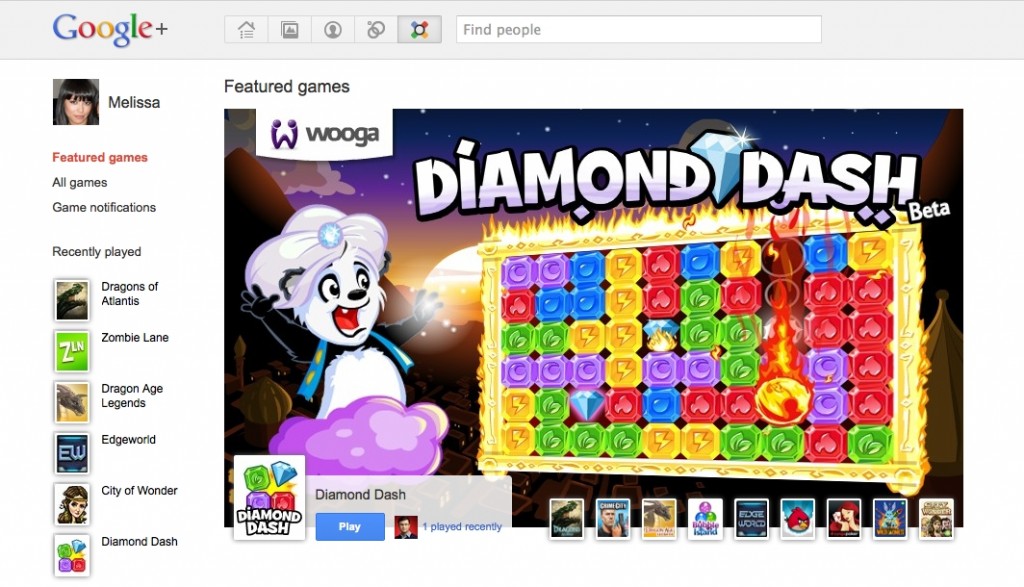
Google+ got game(s)

When they first unleashed their social service unto the world, Google promised that it was just the beginning and that there was so much more to come. The first major addition to added since Google+‘s launch is games. Google’s partnered up with a handful of developers to bring popular games to Plus including Angry Birds, Zynga Poker, and Bejeweled Blitz. Google is giving Games its own section; a new Games icon is located right next to the Circles button at the top of the interface. Google reassures users that “Games in Google+ are there when you want them and gone when you don’t.” This means that you shouldn’t expect games-related news to fill up your Stream; Google is clear about keeping that area “focused on conversations with the people you care about.” When you want to browse and play games, see game notifications, and find out what games your friends played recently, you must enter the Games section of Google+. From the get-go Google is drawing a line between conversations and gameplay, and this is something I think most users will instantly appreciate.

Google says that the Games section is starting to roll out to Google+ users today and it will be made “fully available to everyone soon.”

[Via GoogleBlog]

Google+ …what comes after Facebook? A comprehensive tour of Google’s attempt at social.

Google is the king of search. But when it comes to social networking…well, we only have to look at Wave (an experiment that failed) and Buzz (a Twitter competitor that never caught on) for that answer. With Google+, the search giant takes aim at Facebook and it wants to become the destination for socializing with the people you know and the ones you’ll make down the road. The Google+ Project is currently in “Field Test” mode meaning that the company is still working out the kinks and tweaking and adding features to the service while a small selection of users try it out. The project is by invitation-only, and I was able to snag an invite earlier today. Read on after the break as I take you on a tour through the interface and the handful of features the service currently offers.

Continue reading Google+ …what comes after Facebook? A comprehensive tour of Google’s attempt at social.

Twitter brings photos and videos to the forefront, improves search

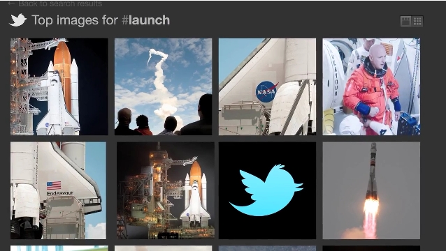
Hello Twitterverse! Today I have some exciting news to share with you. Twitter has teamed with Photobucket to introduce an integrated photo-sharing service for all users. The company will be releasing a feature that allows you to easily upload a photo and attach it to your Tweet directly within Twitter.com. Additionally you’ll be able to easily do this from all of the official Twitter mobile apps, too. If you don’t own a smartphone the company’s working with mobile carriers to figure out a way to send photos via text message. And here’s the best part. Twitter is rolling out “a completely new version of Twitter search” the brings tagged photos and videos into the mix. For example, if you upload, attach, and tweet a picture from a shuttle launch and include the hashtag #launch, you will be brought to all of the most buzzed-about tweets, pictures, and videos relevant to that specific hashtag. Relevant and expansive photo and video clouds are just a click away. In addition, the revamped search engine promises to deliver more relevant Tweets when you search for something or click on a trending topic.

So when can you expect to see all these new features hitting the social network? The improved search engine is being rolled out today, the Twitter.com photo upload service will make its way to users over the next several weeks, and the mobile apps will see an upgrade that’ll bring these enhancements “soon.” Jump after the break to see the new search+photo services in action.

[Via Twitter] Continue reading Twitter brings photos and videos to the forefront, improves search

The new Facebook profile page design put to good use

Facebook gave profile pages a new look, and an employee from the Stinson Design agency quickly figured out how to create the coolest profile, period.  I believe it was French artist Alexandre Oudin who figured out how to visually express himself in this manner first, and the Stinson man ramped it up with the embedded YouTube video.  Look after the break to see Oudin’s profile page. Continue reading The new Facebook profile page design put to good use

TIME Person of the Year is Facebook’s Mark Zuckerberg (and other TIME Top 10 things)

The man behind the social network has been crowned TIME’s Person of the Year “for connecting more than half a billion people and mapping the social relations among them, for creating a new system of exchanging information and for changing how we live our lives.”  Click here to read the 10-page cover article.  Zuck beat out the trapped Chilean Miners, Wikileaks founder Julian Assange, Afghanistan’s president Hamid Karzai, and The Tea Party.

The zine also named the top ten albums and songs of the year.  Here’s what they had to say about the #1 album, Kanye West’s My Beautiful Dark Twisted Fantasy: “Kanye West can seem like an attention-hungry young child who constantly tugs on his mother’s pant leg, saying, “Watch this! Watch this!” But once Kanye got our attention, instead of a simple somersault, he delivered the musical equivalent of a one-handed back handspring.”  Cee Lo Green’s “F**k You” is Time’s #1 song.  Look after the break to see the full listing of TIME’s top ten albums and songs.

Other TIME Top 10 things worth noting: in the Top 10 TV Series category they included Parks and Rec, Party Down, and Boardwalk Empire; in the Top 10 TV episodes they included Community‘s “Modern Warfare”, Lost‘s “The End”, and Fringe‘s “Peter” (!).  Really digging the selection here.  The Social Network and Toy Story 3 are listed in the Top 10 Movies category, Angry Birds is a top video game, and Merton on Chatroulette, Bed Intruder, and Double Rainbow are favorite viral videos.  Again, look after the break to see the full listings from all of these categories to see if your favorites made the cut.  Or you can opt to head over to TIME to view many other Top 10 categories ranging from popular toys to scientific discoveries.

[Via TIME, here & here] Continue reading TIME Person of the Year is Facebook’s Mark Zuckerberg (and other TIME Top 10 things)

Your Facebook profile page is about to receive yet another facelift

Another day, another Facebook revamp–am I right?  Though most people love to share their gripes about Facebook’s incessant need to change the way it looks, this particular change to our profile pages is actually (and I can’t believe I’m saying this) a good one.  Read on to find out why.

When you receive the profile page update and head over to your page, the first change you’ll notice is up top where your name is located.  Tabs are gone (they’ve been moved to the left-side pane, but more on that later) and under your name now you’ll find “a quick summary of who you are”, as Facebook so eloquently describes it.  What looks like a jumble of words at first is actually a list of key information pertaining to you.  For example, if you provide info. like your relationship status, where you go to school and what you’re studying, where you live, where you’re originally from, where you work, what languages you speak, and your birthday–all of this will be listed under your name and viewable by friends.  Directly beneath this “about me” section is a collection of recently tagged photos featuring you.  Keep in mind these highlighted photos are static; you cannot change the order of them.  All you can do is tap a small “x” to hide a particular recent photo and it will be replace by the next most recent tagged photo. Pretty cool way to “show what you’ve been up to lately”, I guess. Continue reading Your Facebook profile page is about to receive yet another facelift

Social Network Sneakers

Check out these “social network sneakers” designed by Gerry Mckay for Adidas.  These are purely conceptual sneaker designs for now.  If people start demanding these be produced for consumption, Adidas can give the go ahead to make it happen.  Though various blogs are hatin’ on the very idea of a sneaker based on a social networking website, I happen to find the designs extremely attractive.

Mckay’s idea is to merge the classic Adidas Superstar sneaker (which celebrated 35 years in 2006) with Twitter and Facebook branding.  The Twitter Superstar features the recognizable light blue color scheme and Twitter ‘bird’ logo as a “visual element.”  The Facebook Superstar is inspired by Facebook’s dark blue on white color scheme and it features the Facebook type logo at the heel of the shoe and on the tongue beneath the Adidas logo.  On the inside wall of the shoe two Facebook slogans read: Facebook is a social utility that connects you with the people around you” & “Making the world open and connected”.

Take a closer look at the Superstar sneaker designs in the gallery below.  Sure, socially-inclined sneakers sound lame but these designs are simple, smart, and definitely appealing.

[Via Behance, here & here; BuzzFeed; Gizmodo]