Tag Archives: social network

Facebook extends the Like button with new Reactions, Twitter adds GIFs & Snapchat offers on-demand geofilters

The Like button has been a Facebook staple since 2009. It gives the social network’s massive user base a quick and easy way to react to posts shared. Over the years, the Like button has heavily influenced the way we interact with media across other social platforms including Facebook-owned Instagram and competitors Twitter, Periscope, and Vine. Simply tap to tell a friend you acknowledge and like what they’re saying. But therein lies the issue, and today Facebook took a major step to remedy it.

Say your best friend is having a bad day because his family pet passed away, or she didn’t get accepted into her first-choice college. “Liking” posts of this nature really doesn’t make any sense now does it? And yet we still do it, since clicking that thumbs up button tells your friend that you’ve read and sympathized with them (without you having to actually comment on the matter).

Introducing Reactions, “an extension of the Like button” that gives Facebook users more ways to react to a post. Now if it’s not appropriate to “like” something, you can express love, humor, excitement, sadness, and anger. The Like button remains, but now if you hold down the Like button on mobile or hover over it on desktop, you’ll be presented with a heart icon representing Love and four emoji faces aptly named Haha, Wow, Sad, and Angry. It’s almost as if the cast of Pixar’s Inside Out came to save the day!

It’s interesting to note that Facebook put a lot of effort into choosing these specific reaction emotions. “For more than a year we have been conducting global research including focus groups and surveys to determine what types of reactions people would want to use most,” says company Project Manager Sammi Krug in a blog post. “We also looked at how people are already commenting on posts and the top stickers and emoticons as signals for the types of reactions people are already using to determine which reactions to offer.”

Curious as to why they simply didn’t add a “Dislike” button? “It would have been too binary,” Krug told Engadget. “This way, though, you’ll have more ways to express yourself. That’s the goal.”

Want to try out the new Reactions? Facebook is rolling out the new feature across its desktop and mobile platforms worldwide starting today, so be on the lookout for it!

Learn about new updates at Twitter and Snapchat after the break. Continue reading Facebook extends the Like button with new Reactions, Twitter adds GIFs & Snapchat offers on-demand geofilters
Snapchat upgrades video capabilities and Twitter invites users to poll, like & heart

Snapchat’s selfie Lenses and Twitter’s Moments were just the beginning of new updates sprinkled on the popular social networks. Let’s discuss the new features and changes making their way to your mobile devices, in brief.

The app that does away with your fleeting snaps has added additional functionality to shooting its equally fading video recordings. After shooting a video, swipe through the handy filters and you’ll notice three new ones. Instead of switching up the physical appearance of the videos, they actually play around with speed. A filter marked with a snail aptly slows down your recording. Another marked by a rabbit speeds it up, and a third one plays your clip in reverse. Snapchat calls these fun new filters Speed Modifiers, and they are baked into the app’s latest update. Also included in the refreshed app is 3D Touch support; so, if you own an iPhone 6s or 6s Plus, you can now force touch the app to pull up quick action shortcuts to chat with friends and add some more.

Twitter, on the other hand, has pushed polls out to everyone. Now you can create your very own poll to receive near-instant feedback from your followers about a topic you’e concerned about. Creating and tweeting out a poll is simple as pie. Update the app and when you go to compose a tweet, you’ll notice a new pie chart icon next to the location and camera icons. Click it to compose a poll, and you’ll have 166 characters to ask a question and 20 characters each for two choices your followers can choose from when responding to the poll.

Elsewhere, and most recently, Twitter is switching up its vernacular when it comes to Favorites. To the point, Favorites are now Likes, and the symbol has been changed from a star to a heart. Many users are confused about the sudden, erm, change of heart, and in a blog post the company does its best to support the facelift:

We are changing our star icon for favorites to a heart and we’ll be calling them likes. We want to make Twitter easier and more rewarding to use, and we know that at times the star could be confusing, especially to newcomers. You might like a lot of things, but not everything can be your favorite.

The heart, in contrast, is a universal symbol that resonates across languages, cultures, and time zones. The heart is more expressive, enabling you to convey a range of emotions and easily connect with people. And in our tests, we found that people loved it.

Love it or hate it, Likes and hearts are the new Favorites and stars and you better get used to it as they’re rolling out Twitter’s mobile apps and desktop web portal today.

[Via TechCrunch; Twitter 1, 2]

Twitter’s Moments grants you access to fleeting trending topics in a new & interactive way

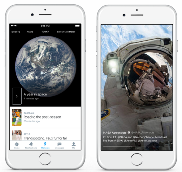
Twitter’s added a new section to its mobile and desktop portals called Moments. This particular social network works best when its users spread breaking news in an instant across the world. Twitter’s latest hub, Moments, provides a streamlined way to access such breaking news, whether or not you follow the accounts commenting on world affairs. For example, let’s say it’s awards season and the Oscars are airing live and you’re interested in knowing the night’s winners and the big, ahem, moments from the show. You’re away from a TV and the majority of your friends and other accounts you follows typically don’t post entertainment-related tweets. Moments relives you of this quagmire; simply click the new tab to view an interactive and visually appealing hub home to trending moments happening right now. If the Oscars are on, you’ll see related tweets, GIFs, Vines, and more, regardless of who you follow on the regular. You can even opt to follow a Moment–related tweets from relevant accounts will show up on your timeline. When the Moment ends (when related tweets start to die down), Twitter will automatically unfollow the Moments and you’re timeline will return back to normal.

Visually speaking, Moments is essentially an interactive version of the Trending Topics list that’s hidden inside Search on mobile. In the new hub you can quickly glance at topics people are raving and/or ranting about, with images and video to help contextualize it all. In addition to following Moments, you can also favorite and retweet sub-tweets inside Moments. Categories include Today, News, Sports, Entertainment, and Fun.

Moments are curated by Twitter as well as content partners including Bleacher Report, Buzzfeed, Entertainment Weekly, Fox News, Getty Images, Mashable, MLB, NASA, New York Times, Vogue, and the Washington Post. Even more partners are promised in the future.

iPhone and Android users can explore Moments on their mobile devices today, and desktop users in the US also have access to it as well. If you’re outside the US, the Moments hub is still out of reach (for now), but you can still access them whenever you see a Moment shared in your timeline.

If you’re someone who doesn’t like to follow celebrities or sports figures but still enjoys being “in the know” across interests like entertainment and sports, Moments is the destination to get your fix, right now.

[Via Twitter]

Twitter & Snapchat updates you should know about

This week, two of the most prolific social networks received some exciting updates. Let’s start with the little blue bird, and then we’ll talk about the playful yellow ghost.

Twitter is updating one feature and tacking on a completely new one. Direct Messages is getting a beefed up with the added ability to host group conversations. Private DMs can now entertain up to 20 people in one threaded conversation. You can start conversations with any of your followers and they don’t all need to follow one another in order to join and participate in the chat. When you’re added to a group chat, you’ll receive a notification about it.

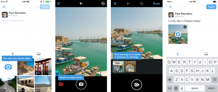
I’ve been waiting for this next new feature for quite some time. Twitter is finally unleashing an official way to post video to its service. The update lets you capture, edit, and share videos that can last up to 30 seconds in length. iPhone users can upload videos from the camera roll as well (coming soon to Android). It’s a simple feature, but it has been desperately missing for ages. Twitter is confident its users will discover unique ways to interact with their followers using video–30 seconds is a helluva lot longer than Vine’s constrained 6. Video, along with group DMs, are rolling out to all users “in the coming weeks.”

Now, jump after the break to learn all about the latest addition to Snapchat’s growing story. Continue reading Twitter & Snapchat updates you should know about

Twitter previews new profile design layout

Twitter is rolling out a new design layout for web profiles. The most prominent visual changes are larger profile photos and customized headers that mimic Facebook’s profile and cover photos. Dig a bit deeper and you’ll see that the update allows users to pin a tweet to the top of their feed; this locked-at-the-top tweet serves as an extension to a user’s bio and provides followers and potential followers alike another window into seeing what you’re all about. You may also notice magnified tweets that appear larger in your feed; these are called your “Best Tweets” and they appear larger because they’ve received the most engagement such as being Favorited or Retweeted a lot. Also, when you check out other people’s profiles you can filter between all Tweets, Tweets with photos/video, or Tweets and replies–a new way to quickly search a person’s feed by content type.

The new profile layout is slowly rolling out to all users “in the coming weeks.” If you’re new to Twitter and sign up today you’ll automatically see it. For everyone else, you can preview the new layout today by flocking over to certain celeb accounts such as @ChanningTatum and @KerryWashington.

[Via Twitter]

Netflix introduces a social recommendation engine with Facebook friends

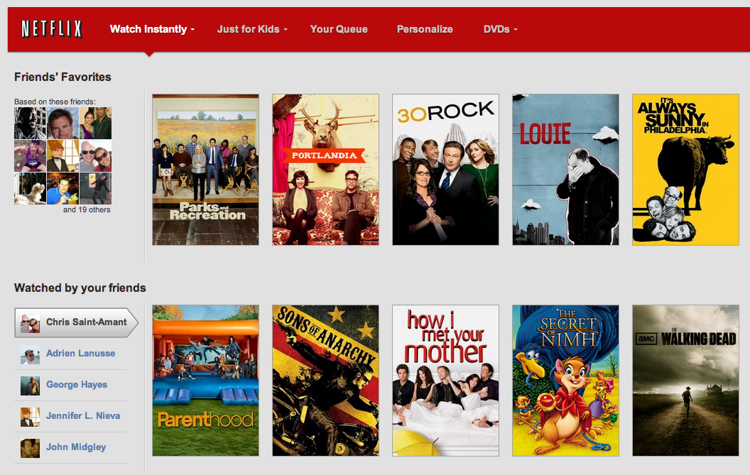
Netflix already does a great job at recommending to its users TV shows, movies, and documentaries based on what you watched in the past and the ratings you give the content you watch. This week the streaming company launched a new way to discover content with a social spin. Subscribers can now link their Facebook account with Netflix to see what their friends are watching. Once the accounts are linked, Netflix users will notice a new “Watched by your friends” row in the streaming site’s main menu as well as a row called “Friends’ Favorites” that features content watched by friends that they have rated with four to five stars. Additionally, friends will be able to see what you watch and rate highly; but if you’ve got a guilty pleasure you don’t want to be shared you can easily click the “Don’t Share This” button in the player. Netflix notes that by default all this social sharing with Facebook friends happens on the Netflix side of things only. If you want your Facebook friends to see what you’re watching on Facebook, you have to dig into Your Account, Social Settings to flip the switch on; there you can also stop sharing altogether if you don’t want to take part in the new social recommendation engine.

Currently the Netflix/Facebook cross-sharing initiative is live in the U.S. Netflix says they will “continue to experiment and improve our social features over the coming months and years.” Click after the break to watch a brief demonstration of this at work across Netflix.com in the browser as well as on the PlayStation 3.

[Via Netflix] Continue reading Netflix introduces a social recommendation engine with Facebook friends

New changes coming to Facebook: the News Feed gets a “clutter-free” redesign

Heads up, Facebookers; there’s a new design update coming to the ubiquitous social networking site. Before it lands in your lap, get a quick overview of what to expect right here, right now.

After overhauling profile pages and search, Facebook’s next task is to revamp the News Feed by reducing clutter and making the site’s main portal even more personal. The site promises “you [will] see all the stories you saw in your News Feed before, but with a fresh new look.” Each story (or post) that your friends share will show up in your News Feed will be highlighted in new ways to make content discovery easier; for example, photos, news articles, maps, and events will appear larger and brighter and more colorful and vibrant. Also new is the addition of several feeds users can choose from. There’s a new drop-down menu in News Feed that allows you to dig deeper into specific content your friends are sharing. For example, the Photos feed filters out everything except for the photos your friends are posting; the Music feed tells you what your friends are listening to and provides you information about the artists you like; and the Following feed will show you the latest news from the Pages you like and the people you follow. Mark Zuckerberg says the enhanced News Feed aims to “give everyone in the world the best personalized newspaper we can.”

The new and improved News Feed is inspired by Facebook’s mobile presence. For example, the left-hand menu that users are used to exposing with a flick from the left-hand side of a tablet or smartphone’s screen will soon be accessible in desktop browsers. Also, users will have the ability to jump right to the top of News Feed whenever new stories trickle in. The main reason for porting over these mobile functions is to unify the overall Facebook experience across all devices. The “same clean look” will soon be present on our phones, tablets, and desktop browsers.

When is “soon” exactly? Facebook isn’t providing a hard date for the switchover, but the new News Feed will slowly roll out over the coming weeks on web and mobile, so says the company. If you’re itching to get your hands on the new design, you can join the feature’s waiting list right here; that site will also give you a visual rundown of it all. Facebook employees discuss the inspiration and vision for the News Feed redesign in a brief video embedded after the break.

[Via Facebook 1, 2] Continue reading New changes coming to Facebook: the News Feed gets a “clutter-free” redesign

Facebook introduces Graph Search, a new intuitive way to search across your social network

On Tuesday Mark Zuckerberg hosted a Facebook event to announce an exciting new feature for his prolific and widespread social network. It’s a new way to search inside Facebook and it’s called Graph Search. Essentially Graph Search gives Facebook users the ability to make specific searches across their network of friends. For example, enter the query “my friends in New York who like Jay-Z” and a list of your friends with those specific qualifications will be provided to you. Initially Graph Search will focus on four main areas: people, photos, place, and interests. Here are a few more examples of queries you could use: “software engineers who live in San Francisco and like skiing,” “photos of my friends before 1999,” “Indian restaurants liked by my friends from India,” “movies liked by people who like movies I like.” As you can see some of these queries are a mouthful and can be very specific and Facebook is working hard to crunch all the data and develop advanced natural language recognition.

How will the new search be integrated into the site? “Graph Search will appear as a bigger search bar at the top of each page. When you search for something, that search not only determines the set of results you get, but also serves as a title for the page. You can edit the title – and in doing so create your own custom view of the content you and your friends have shared on Facebook.”

According to the social network this new feature is guiding the company back to its roots. “When Facebook first launched, the main way most people used the site was to browse around, learn about people and make new connections. Graph Search takes us back to our roots and allows people to use the graph to make new connections.” How is Graph Search different from a typical web search? Facebook explains: “Web search is designed to take a set of keywords (for example: “hip hop”) and provide the best possible results that match those keywords. With Graph Search you combine phrases (for example: “my friends in New York who like Jay-Z”) to get that set of people, places, photos or other content that’s been shared on Facebook.” Additionally, Graph Search was built “with privacy in mind;” in other words, your privacy choices determine what’s searchable.

Currently Graph Search is in beta and initially it’s rolling out slowly to users who use Facebook in English. If you want to be one of the first to try it out, you can join a wait list. Facebook sees Graph Search as an ongoing project that will continue to develop and grow and get smarter as more people use it and provide feedback. Also rolling out to Facebook users soon is integrated Bing search. For now, check out some screenshots in the gallery below and click to Facebook to watch Zuckerberg and company discuss the bold new initiative.

This new search functionality aims to tap into the goldmine of personal information people share on Facebook and take social discovery to a new level. Visiting friends and family back east and want to plan a movie marathon? With Graph Search you can quickly find out which of your friends live nearby and figure out their movie preferences in one fell swoop. Finally, an intuitive way to take all of your Likes and interests and places and photos and put it to good use.

[Via Facebook 1, 2]

Access your Twitter archive today

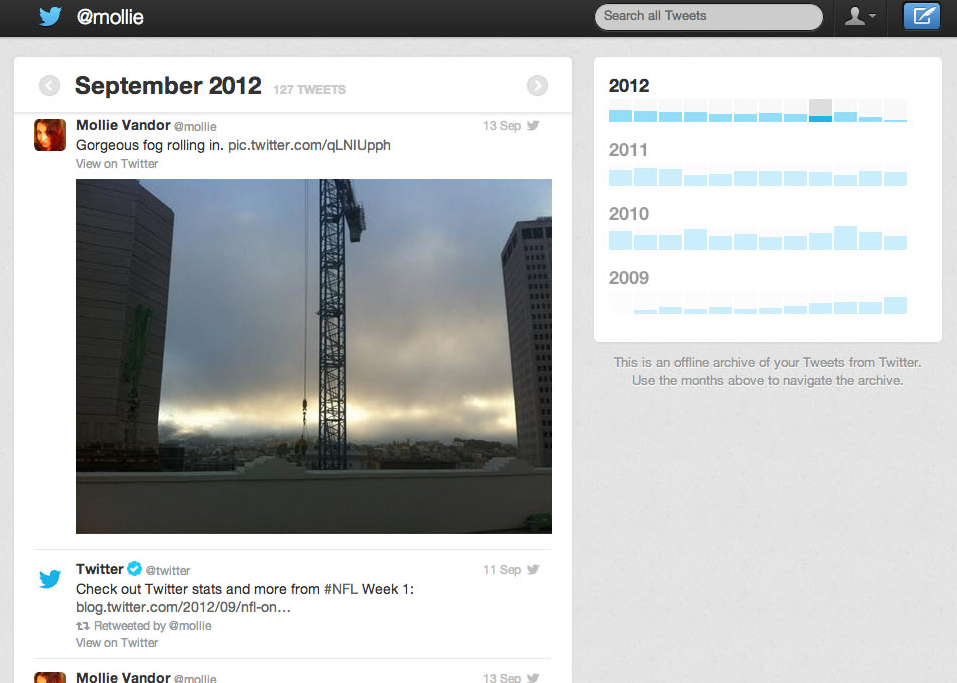
At last, Twitter is making it possible to go back in time and explore every single tweet you’ve ever tweeted into the Twitterverse. Starting today, the company is rolling out a new feature that allows you to download an HTML file containing your Twitter archive that contains all your tweets (including retweets) you blasted out since you signed up for the service. The archive loads in your browser and features an interface you are used to by now. A history of your tweets is organized by month, or you can use the search bar to find tweets with certain words, phrases, hashtags, or @usernames.

To access your archive, login to your Twitter account and go to Settings, Account, and scroll to the bottom where you’ll find a new option to “Request your archive.” Click the button and check your email for instructions on how to download and view your archive. According to the company this new feature is rolling out “slowly, starting today with a small percentage of users whose language is set to English.” So if you don’t see it at this very moment, be patient. For everyone else, the ability to download your archive will come “over the coming weeks and months.”

Now go on, memories await.

[Via Twitter]

Twitter embraces filters, more profile personalization

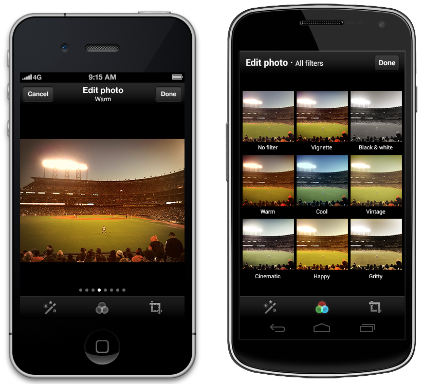
Twitter is imitating its competition–namely Instagram, duh!–by giving its users the ability to place a variety of filters on top of photos. At launch a total of eight filters, “ranging from black & white to vintage,” are available to play around with. You can see how each filter affects a single image at once, or you can swipe through each one full-size. In addition to filters, the latest update to the app also brings auto-enhance and cropping for photographers looking to tweak their images on the go. Download Twitter in the App Store and Google Play today.

In related news, the character-limiting social networking company is introducing a new way to further personalize your profile page. Since Twitter’s inception users have been able to upload a profile picture and a background image for desktop tweeters to see. Now there’s a third option thrown into the mix: header photos. Now you can choose an image to display on your profile page that exists above your timeline and behind your profile picture. If you choose not to upload one, a static grey rectangle will house your profile picture, name, handle, about info, location, and website. To add a header photo, go to Settings, Profile. Once put in place, like your profile picture it will be viewable on mobile devices as well as the desktop interface. This was initially introduced in September, but as of December 12 it has rolled out to all users. So have at it!

Jump after the break to view two cartoony clips that explore Twitters new announcements.

[Via Twitter 1, 2] Continue reading Twitter embraces filters, more profile personalization

Facebook reaches one billion active users

A million users isn’t cool. You know what’s cool? A billion users.

Today Mark Zuckerberg announced that there are more than one billion people using Facebook actively each month. In his own words through a short but sweet blog post:

This morning, there are more than one billion people using Facebook actively each month.

If you’re reading this: thank you for giving me and my little team the honor of serving you.

Helping a billion people connect is amazing, humbling and by far the thing I am most proud of in my life.

I am committed to working every day to make Facebook better for you, and hopefully together one day we will be able to connect the rest of the world too.

Whether or not this incredible factoid will help boost the social network’s failing stock, it’s something to really think about. What this means is that one in seven people all around the world log on to Facebook and actively spend time there for at least a month. Zuckerberg tagged his post with a fact sheet that spits out other impressive bits of info like… there have been over 1.13 “likes” since the site’s launch; 219 billion photos uploaded; 17 billion location-tagged posts; 62.6 million songs have been played 22 billion times; Facebook now has 600M mobile users; the median age of the user is about 22 (close your account, mom!); and the list goes on.

To celebrate the milestone, Facebook teamed with ad agency Wieden & Kennedy to produce a minute-and-a-half “brand video” entitled The Things That Connect Us. In an interview with Ad Age, Facebook’s head of consumer marketing Rebecca Van Dyck shared the inspiration behind it. “What we’re trying to articulate is that we as humans exist to connect, and we at Facebook to facilitate and enable that process. We make the tools and services that allow people to feel human, get together, open up. Even if it’s a small gesture, or a grand notion–we wanted to express that huge range of connectivity and how we interact with each other.”

The ad is embedded after the break. Continue reading Facebook reaches one billion active users

Google+ goes under the knife to provide a more streamlined experience

The next time you login to Google’s social network things will look entirely different. That’s because the search giant has gone ahead and updated Google+’s interface practically from head to toe. You’ll notice that the static icons that used to live up top have been replace by a dynamic ribbon of applications that are now located to the left. Apps can be organized to your liking and quick actions can be accessed simply by hovering your cursor over them. Your list of Google+ and Gmail Chat buddies can be exposed to the right in a move that mimics Facebook’s sidebar. Other big changes include the Explore app that shows you “what’s hot” and trending on the network and Hangouts now has its very own page dedicated to informing you about open Hangouts you might be interested in joining. The new version of Google+ is currently rolling out to all members of Google’s social spot, so log in and explore the alterations and new additions today. After the break there’s a video highlighting it all.

[Via Google] Continue reading Google+ goes under the knife to provide a more streamlined experience