Tag Archives: search engine

Google introduces the Knowledge Graph, makes search even smarter

Last month Google started rolling out their next evolution in search and they call it the Knowledge Graph. Here’s how they describe it:

The Knowledge Graph enables you to search for things, people or places that Google knows about—landmarks, celebrities, cities, sports teams, buildings, geographical features, movies, celestial objects, works of art and more—and instantly get information that’s relevant to your query. This is a critical first step towards building the next generation of search, which taps into the collective intelligence of the web and understands the world a bit more like people do.

Go to Google and search “Tom Cruise.” In addition to the typical results (links to his official website, Wikipedia and IMDb pages), you will surely notice the Knowledge Graph to the right. Google’s search engine now aims to understand your query and pull together relevant information for you to easily glance at. You’ll see an image of the actor, along with a brief description borrowed from Wikipedia including date of birth, his spouse, children, and a list of the movies he’s been in. Underneath all that you’ll find a “people also search for” section that serves as a recommendation hub for further research.

To reiterate, the Knowledge Graph will provide information based on your query. For example, if you search “Empire State Building” you can quickly glance to the right to find relavant information such as the height of the building and architectural styles.

It may not seem like a giant leap in the evolution of search on paper, but the more you take advantage of Google’s new offering you’ll come to notice that the Knowledge Graph does come in handy and marks a step in the right direction for intuitive search. Google explains it all in a video embedded after the break.

[Via Google] Continue reading Google introduces the Knowledge Graph, makes search even smarter

Google news: New Google bar, YouTube gets a new look, and the evolution of search

The folks at Mountain View are constantly working hard to bring new experiences to the Internet, as well as updating the ones we use most. You know that horizontal (recently painted black) navigation bar that rests at the top of every Google webpage, including the search homepage? Well, it’s going away to save screen real estate and unify all that Google has to offer. The new Google bar isn’t a bar at all, really. It’s comprised of three sections: Google menu, Search, and Google+ tools. All three of these sections will be found in the spot location across all of Google’s products. The Google menu is accessed by hovering your mouse over the Google logo in the left hand corner, saving you a click to reach Google’s other products like Images, Maps, and Gmail. Search sits in the top middle, and easy access to Google+ tools is on the right. Navigating Google, searching, and sharing links with friends is now a more streamlined and cleaner experience. The new Google bar is rolling out soon.

After months of testing a new layout dubbed “Cosmic Panda” Google has finally rolled out an updated look for YouTube. First off, the homepage is totally redesigned and built to be customized to your liking. To the left you’ll find a YouTube Channel line-up. If you’re signed in with a Google account the setup is like this: a list of your Subscriptions, including Google+ and Facebook social integration; From YouTube categories, including trending and popular videos; and Suggested channels for you. To add a channel to your list simply click the Add channels buttons up top to be directed to a listing of all video categories; subscribing to channels from there is a one-click process. Back on the homepage, when you click a channel from your line-up content will appear in the center of the page. Instead of navigating you to an entirely new URL, the new YouTube homepage keeps you in one place while you’re browsing content. Play a video and then you’ll be brought to the uploader’s channel so you can watch the video and comment on it. Speaking of channels, Google has updated those spaces as well with new templates and a sharper layout. And with inspiration from Cosmic Panda, Google has opted to stick with the trial’s consistent gray background, bigger video thumbnails, and a more streamlined watch page. The new YouTube is available to play with today; sign in with a Google account to customize.

Last, Google has produced an interesting video that tells the “short history of the evolution of search, highlighting some of the most important milestones from the past decade—and a taste of what’s coming next.” Watch it after the break. There you’ll also find videos highlighting the new Google bar and YouTube’s cosmetic transformation.

[Via Google 1, 2, 3] Continue reading Google news: New Google bar, YouTube gets a new look, and the evolution of search

Google gets a makeover

You can call it Exteme Makeover: Google Edition. Over the past few weeks Google has been rolling out a new look across many of their services, including the Google homepage, Gmail, Google Calendar, and YouTube. “The way people use and experience the web is evolving, and our goal is to give you a more seamless and consistent online experience—one that works no matter which Google product you’re using or what device you’re using it on,” explains Google. In a word they’re simply streamlining all their intertwined experiences, and the changes are ” founded on three key design principles: focus, elasticity and effortlessness.”

At Google‘s homepage you’ll surely notice the new black strip located across the top; the colorful logo is smaller and centered, the Search and Lucky buttons have a new hue, and the About, Privacy, and Advertising links have been moved to the bottom left-hand corner of the page. In Gmail and Calendar everything is bolder and more roomier to match the new homepage aesthetic. Design cues were certainly carried over from Google+. Google’s also experimenting with YouTube’s look; Cosmic Panda is the codename for the video player’s new sheen. YouTube is positively sleek in its new coat of paint.

Google’s homepage and Calendar changes have been rolling out to users automatically. To experience Gmail and YouTube’s new flairs you must enable it manually. In Gmail, select “Preview” and “Preview (Dense)” themes in the Themes tab in Gmail Settings; to play around with Cosmic Panda head over to this YouTube portal and click “Try it out.” Since Google’s still testing it out and awaiting customer feedback, you can revert back to the classic look at any time.

It will take time for every Google service to fall in line aesthetically with the new homepage, but there’s no denying that Google’s first wave of cosmetic changes is simply delightful and, well, downright sexy.

Google intros Voice Search & Search by Image

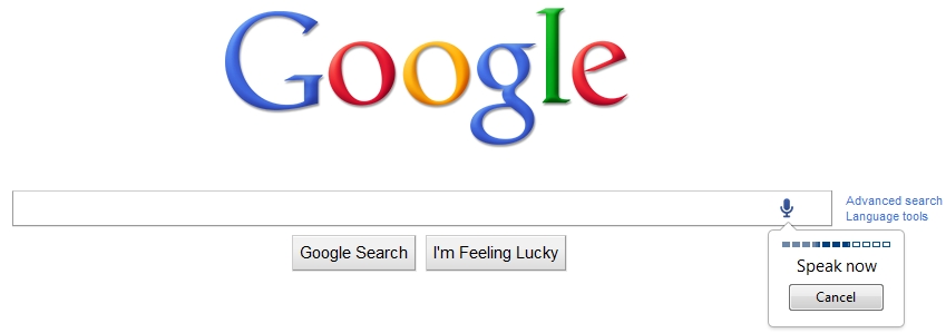
I’m sure you noticed the new microphone icon that sits in the far right corner of the Google search box. Click it and now you can speak your search! Google hopes that this new feature will be useful for hard-to-spell and complex searches. Voice Search is rolling out now on google.com in English; if you don’t see it yet you should soon.

When you head over to Google Images, a new camera icon replaces the microphone in the search box. Click it to upload any picture from your computer or paste in an image URL from the web and Google will try to figure out what it is and provide relevant results. For example, if you upload an old vacation photo Google will try to pick out and identify landmarks and then instantly provide other images and relevant websites pertaining to the landmark. Give it a try at images.google.com. The new feature is being rolled out now globally in 40 languages.

Note that these new features require the Chrome browser to work. Search by Image, however, can be used inside Firefox if you download the appropriate extension available here. Demonstration videos sit after the break.

[Via GoogleBlog] Continue reading Google intros Voice Search & Search by Image

Want to learn more about this year’s holiday-themed Google doodle?

On Thursday the holiday-themed Google doodle you see right now was unveiled to the masses.  This year was rife with all kinds of Google doodles (from Pac-Man to UFOs), but this one’s being touted as the “most ambitious one yet.” Chief Google doodler Michael Lopez (yes, that is a real position) headed this year’s festive doodle with a team of four other artists.  It took them over 250 hours to complete the 17 interactive portraits of holiday scenes. Originally, the plan was to unveil the doodle in stages over three days, but at the last minute Google execs decided that it’d be best to push out the doodle in one piece and keep it up for two-and-a-half days.  Lopez and his team rushed to make it happen, and they managed to put it up just in time around 9am Thursday morning.  The majority of the holiday scenes focus on food, dance, architecture, and textile from all around the world. Google estimates that it has created over 900 doodles since 1998, with approximately 270 of them running in 2010.  Of all the doodles thus far, this one seems to be the one that most diverges from spelling out the search engine’s name.  Can you find where it says “Google” there?  It’s very subtle.  Anyway, can’t wait to see what Lopez has in store for us next year!

[Via WSJ]

Google doodles will now show up on your mobile

You ever notice that Google’s myriad of doodles almost never port to Google.com when you’re accessing the search site on your cell phone?  Well those days are over people.  This week Google announced that they’re bringing the doodles initially to Android (2.0 and higher) and iOS (3 and higher) devices worldwide.  So now when you see an awesome or interesting Google doodle on your desktop at home, you can expect to see it on your mobile device, too.  Now we can become sleuths on-the-go!

[Via GoogleBlog]

Google Instant makes its way to mobile devices

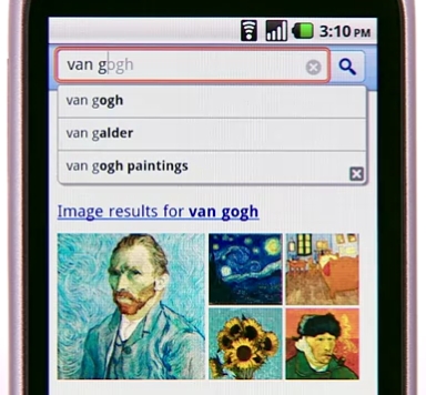
Today Google made good on their promise bringing the power of Google Instant search to the mobile space.  When you access Google.com and begin to type your query, the search bar snaps to the top of the screen and Instant does its thing.  The new functionality works over 3G and WiFi connections, but Google gives you the option to turn it off during those slow surfing times.  There’s a turn on/turn off button located beneath the search bar on the home page for easy access.

Instant for mobile is currently in beta, and it’s available for iPhone and iPod (running iOS4) and Android (running 2.2 Froyo) users in the U.S.  Additional country, language, and device support is in the works.  Look after the break to watch a brief demonstration.

[Via GoogleBlog] Continue reading Google Instant makes its way to mobile devices

Google search gets a new look & feel

So have you noticed something different about Google lately?  This past week Google rolled out a new look and some welcome features to their search platform.  Least significant but still noticable is the refreshed Google logo on the home page; it’s definitely more colorful, isn’t it?  Moving right along.. Google has added a “contextually relevant, left-hand navigation” panel to the search results page.  Now whenever you search a keyword, a navigation panel reveals itself to help refine your query.  There’s three parts to the panel.  First there’s Universal Search; “the top section suggests the most relevant genres of results for your query and lets you seamlessly switch to these different types of results.”  Everything is selected be default, but you have the option to switch the search feed depending on the type of information you’re looking for about the query.  For example, if you search “wind power”, Google automatically does a normal search for the term, but now it also helps you find that term within other relevent places such as news, blogs, images, and books.  Next there’s Search Options; this “enables you to get a different view of your results” by sorting search results by time, timelines, “wonder wheels”, image previews and more.  Lastly there’s Google Squared; this addition utilizes Google’s “Something different” feature which “helps you find and compare entities” by offering other related topics to search.  All of these new parts are built right into the left-hand navigation panel.  Welcome to the modern age of Google search.  Look after the break for a brief video rundown of the new features described here.

[Via GoogleBlog] Continue reading Google search gets a new look & feel

Microsoft Bing, the next Google?

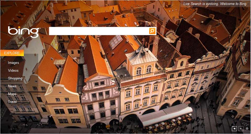
MS Bing

No, the new search engine by Microsoft is not the next Google.  But it is a positive force in the search engine arena.  Bing allows you to search the categories phrases, images, videos, shopping, news, maps, and travel.  What is interesting about Bing is that when you make a search, not only does it provide links about your search term, but it also gives you local information that relate to your searched item.  For example, if you search “video games,” sites like GameSpot, GameTrailers, and others show up.  At the bottom of the search, Bing also shows you video of the lastest games and locations where you might want to rent/buy a video game near you.  Another nice touch: when hover over a related link, Bing provides a quick synopsis of what is contained in that site.  Yes, the Bing user interface is clean, fresh, and easy…but this is not enough to overtake other search engine overlords like Google and Yahoo!.  Many of the local features in Bing can be found in iGoogle and Yahoo!’s personalized websites.  If Microsoft wants to truly make an impact in this sector of the Internet, it must use Bing in creative new ways and offer services that have not yet been tried again and again by Google and the others.  Try it out for yourself; Bing is officially up and running today: www.bing.com.  Also, check after the break for the first commercial for Bing; it’s interesting. Continue reading Microsoft Bing, the next Google?