Tag Archives: search

Facebook introduces Graph Search, a new intuitive way to search across your social network

On Tuesday Mark Zuckerberg hosted a Facebook event to announce an exciting new feature for his prolific and widespread social network. It’s a new way to search inside Facebook and it’s called Graph Search. Essentially Graph Search gives Facebook users the ability to make specific searches across their network of friends. For example, enter the query “my friends in New York who like Jay-Z” and a list of your friends with those specific qualifications will be provided to you. Initially Graph Search will focus on four main areas: people, photos, place, and interests. Here are a few more examples of queries you could use: “software engineers who live in San Francisco and like skiing,” “photos of my friends before 1999,” “Indian restaurants liked by my friends from India,” “movies liked by people who like movies I like.” As you can see some of these queries are a mouthful and can be very specific and Facebook is working hard to crunch all the data and develop advanced natural language recognition.

How will the new search be integrated into the site? “Graph Search will appear as a bigger search bar at the top of each page. When you search for something, that search not only determines the set of results you get, but also serves as a title for the page. You can edit the title – and in doing so create your own custom view of the content you and your friends have shared on Facebook.”

According to the social network this new feature is guiding the company back to its roots. “When Facebook first launched, the main way most people used the site was to browse around, learn about people and make new connections. Graph Search takes us back to our roots and allows people to use the graph to make new connections.” How is Graph Search different from a typical web search? Facebook explains: “Web search is designed to take a set of keywords (for example: “hip hop”) and provide the best possible results that match those keywords. With Graph Search you combine phrases (for example: “my friends in New York who like Jay-Z”) to get that set of people, places, photos or other content that’s been shared on Facebook.” Additionally, Graph Search was built “with privacy in mind;” in other words, your privacy choices determine what’s searchable.

Currently Graph Search is in beta and initially it’s rolling out slowly to users who use Facebook in English. If you want to be one of the first to try it out, you can join a wait list. Facebook sees Graph Search as an ongoing project that will continue to develop and grow and get smarter as more people use it and provide feedback. Also rolling out to Facebook users soon is integrated Bing search. For now, check out some screenshots in the gallery below and click to Facebook to watch Zuckerberg and company discuss the bold new initiative.

This new search functionality aims to tap into the goldmine of personal information people share on Facebook and take social discovery to a new level. Visiting friends and family back east and want to plan a movie marathon? With Graph Search you can quickly find out which of your friends live nearby and figure out their movie preferences in one fell swoop. Finally, an intuitive way to take all of your Likes and interests and places and photos and put it to good use.

[Via Facebook 1, 2]

Google introduces a new way to search on mobile: Handwrite

There’s a new way to search on your mobile device, and it comes from the king of search Google. It’s called Handwrite and the concept is simple: once enabled, Handwrite allows you to use your finger to draw letters to input a search query. Google says they “designed Handwrite to complement rather than replace typing.” Handwrite, still in beta but available for the gen pop to try out, is there for times when pecking at a virtual keyboard is tough–like when you’re a passenger in a bumpy taxi ride, for example. Here’s how to enable Handwrite: go to www.google.com on your mobile device, go to Settings, enable Handwrite, tap Save, and refresh the Google homepage. The Handwrite icon (a cursive “g”) will appear in the bottom right corner of the screen letting you know it’s turned on. Once enabled, you can start drawing letters near anywhere on the screen and you’ll see them appear in the search box. See your query autocompleted by Google in the drop-down list? Click it and your search is complete. It works surprisingly well. If you’ve got a device running OS5+, Android 2.3+ (phones), or Android 4.0+ (tablets), give it a spin today. Video demonstration after the break.

[Via Google] Continue reading Google introduces a new way to search on mobile: Handwrite

Google introduces the Knowledge Graph, makes search even smarter

Last month Google started rolling out their next evolution in search and they call it the Knowledge Graph. Here’s how they describe it:

The Knowledge Graph enables you to search for things, people or places that Google knows about—landmarks, celebrities, cities, sports teams, buildings, geographical features, movies, celestial objects, works of art and more—and instantly get information that’s relevant to your query. This is a critical first step towards building the next generation of search, which taps into the collective intelligence of the web and understands the world a bit more like people do.

Go to Google and search “Tom Cruise.” In addition to the typical results (links to his official website, Wikipedia and IMDb pages), you will surely notice the Knowledge Graph to the right. Google’s search engine now aims to understand your query and pull together relevant information for you to easily glance at. You’ll see an image of the actor, along with a brief description borrowed from Wikipedia including date of birth, his spouse, children, and a list of the movies he’s been in. Underneath all that you’ll find a “people also search for” section that serves as a recommendation hub for further research.

To reiterate, the Knowledge Graph will provide information based on your query. For example, if you search “Empire State Building” you can quickly glance to the right to find relavant information such as the height of the building and architectural styles.

It may not seem like a giant leap in the evolution of search on paper, but the more you take advantage of Google’s new offering you’ll come to notice that the Knowledge Graph does come in handy and marks a step in the right direction for intuitive search. Google explains it all in a video embedded after the break.

[Via Google] Continue reading Google introduces the Knowledge Graph, makes search even smarter

Google news: New Google bar, YouTube gets a new look, and the evolution of search

The folks at Mountain View are constantly working hard to bring new experiences to the Internet, as well as updating the ones we use most. You know that horizontal (recently painted black) navigation bar that rests at the top of every Google webpage, including the search homepage? Well, it’s going away to save screen real estate and unify all that Google has to offer. The new Google bar isn’t a bar at all, really. It’s comprised of three sections: Google menu, Search, and Google+ tools. All three of these sections will be found in the spot location across all of Google’s products. The Google menu is accessed by hovering your mouse over the Google logo in the left hand corner, saving you a click to reach Google’s other products like Images, Maps, and Gmail. Search sits in the top middle, and easy access to Google+ tools is on the right. Navigating Google, searching, and sharing links with friends is now a more streamlined and cleaner experience. The new Google bar is rolling out soon.

After months of testing a new layout dubbed “Cosmic Panda” Google has finally rolled out an updated look for YouTube. First off, the homepage is totally redesigned and built to be customized to your liking. To the left you’ll find a YouTube Channel line-up. If you’re signed in with a Google account the setup is like this: a list of your Subscriptions, including Google+ and Facebook social integration; From YouTube categories, including trending and popular videos; and Suggested channels for you. To add a channel to your list simply click the Add channels buttons up top to be directed to a listing of all video categories; subscribing to channels from there is a one-click process. Back on the homepage, when you click a channel from your line-up content will appear in the center of the page. Instead of navigating you to an entirely new URL, the new YouTube homepage keeps you in one place while you’re browsing content. Play a video and then you’ll be brought to the uploader’s channel so you can watch the video and comment on it. Speaking of channels, Google has updated those spaces as well with new templates and a sharper layout. And with inspiration from Cosmic Panda, Google has opted to stick with the trial’s consistent gray background, bigger video thumbnails, and a more streamlined watch page. The new YouTube is available to play with today; sign in with a Google account to customize.

Last, Google has produced an interesting video that tells the “short history of the evolution of search, highlighting some of the most important milestones from the past decade—and a taste of what’s coming next.” Watch it after the break. There you’ll also find videos highlighting the new Google bar and YouTube’s cosmetic transformation.

[Via Google 1, 2, 3] Continue reading Google news: New Google bar, YouTube gets a new look, and the evolution of search

Google gets a makeover

You can call it Exteme Makeover: Google Edition. Over the past few weeks Google has been rolling out a new look across many of their services, including the Google homepage, Gmail, Google Calendar, and YouTube. “The way people use and experience the web is evolving, and our goal is to give you a more seamless and consistent online experience—one that works no matter which Google product you’re using or what device you’re using it on,” explains Google. In a word they’re simply streamlining all their intertwined experiences, and the changes are ” founded on three key design principles: focus, elasticity and effortlessness.”

At Google‘s homepage you’ll surely notice the new black strip located across the top; the colorful logo is smaller and centered, the Search and Lucky buttons have a new hue, and the About, Privacy, and Advertising links have been moved to the bottom left-hand corner of the page. In Gmail and Calendar everything is bolder and more roomier to match the new homepage aesthetic. Design cues were certainly carried over from Google+. Google’s also experimenting with YouTube’s look; Cosmic Panda is the codename for the video player’s new sheen. YouTube is positively sleek in its new coat of paint.

Google’s homepage and Calendar changes have been rolling out to users automatically. To experience Gmail and YouTube’s new flairs you must enable it manually. In Gmail, select “Preview” and “Preview (Dense)” themes in the Themes tab in Gmail Settings; to play around with Cosmic Panda head over to this YouTube portal and click “Try it out.” Since Google’s still testing it out and awaiting customer feedback, you can revert back to the classic look at any time.

It will take time for every Google service to fall in line aesthetically with the new homepage, but there’s no denying that Google’s first wave of cosmetic changes is simply delightful and, well, downright sexy.

Google intros Voice Search & Search by Image

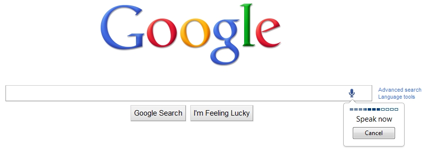
I’m sure you noticed the new microphone icon that sits in the far right corner of the Google search box. Click it and now you can speak your search! Google hopes that this new feature will be useful for hard-to-spell and complex searches. Voice Search is rolling out now on google.com in English; if you don’t see it yet you should soon.

When you head over to Google Images, a new camera icon replaces the microphone in the search box. Click it to upload any picture from your computer or paste in an image URL from the web and Google will try to figure out what it is and provide relevant results. For example, if you upload an old vacation photo Google will try to pick out and identify landmarks and then instantly provide other images and relevant websites pertaining to the landmark. Give it a try at images.google.com. The new feature is being rolled out now globally in 40 languages.

Note that these new features require the Chrome browser to work. Search by Image, however, can be used inside Firefox if you download the appropriate extension available here. Demonstration videos sit after the break.

[Via GoogleBlog] Continue reading Google intros Voice Search & Search by Image

Twitter brings photos and videos to the forefront, improves search

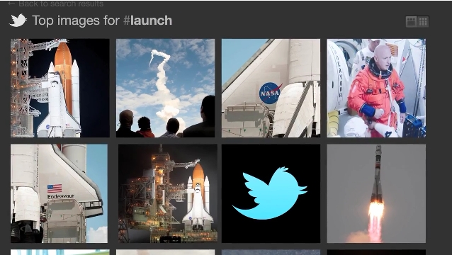
Hello Twitterverse! Today I have some exciting news to share with you. Twitter has teamed with Photobucket to introduce an integrated photo-sharing service for all users. The company will be releasing a feature that allows you to easily upload a photo and attach it to your Tweet directly within Twitter.com. Additionally you’ll be able to easily do this from all of the official Twitter mobile apps, too. If you don’t own a smartphone the company’s working with mobile carriers to figure out a way to send photos via text message. And here’s the best part. Twitter is rolling out “a completely new version of Twitter search” the brings tagged photos and videos into the mix. For example, if you upload, attach, and tweet a picture from a shuttle launch and include the hashtag #launch, you will be brought to all of the most buzzed-about tweets, pictures, and videos relevant to that specific hashtag. Relevant and expansive photo and video clouds are just a click away. In addition, the revamped search engine promises to deliver more relevant Tweets when you search for something or click on a trending topic.

So when can you expect to see all these new features hitting the social network? The improved search engine is being rolled out today, the Twitter.com photo upload service will make its way to users over the next several weeks, and the mobile apps will see an upgrade that’ll bring these enhancements “soon.” Jump after the break to see the new search+photo services in action.

[Via Twitter] Continue reading Twitter brings photos and videos to the forefront, improves search

Google adds Instant Previews to Instant results

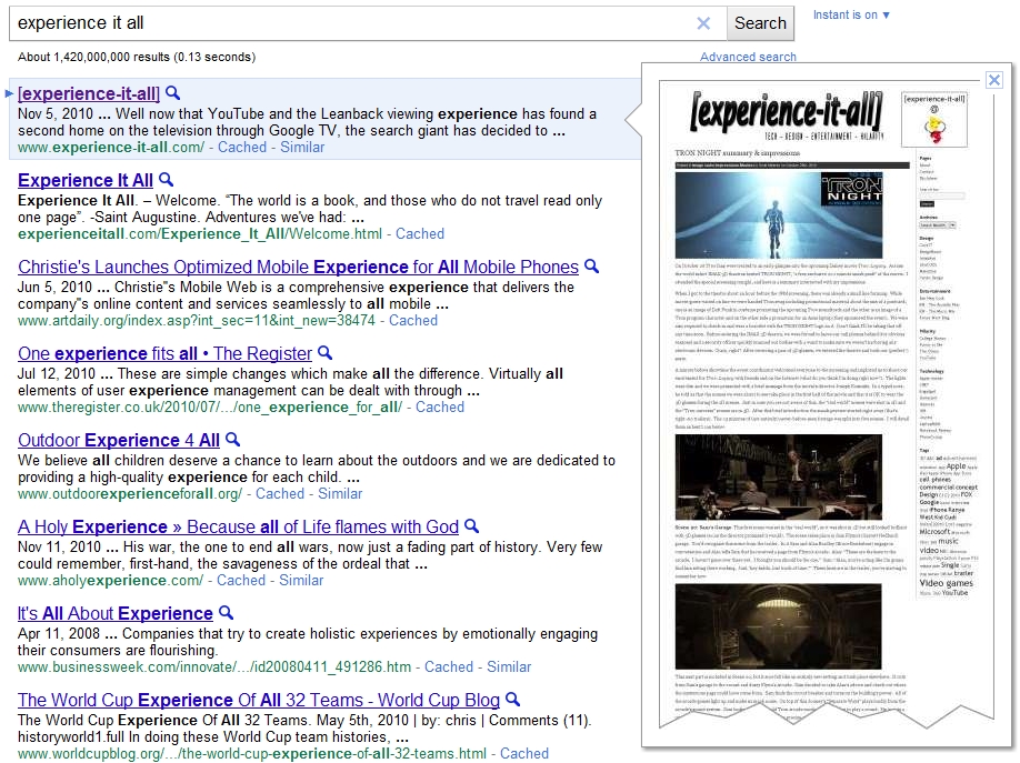
By now you should all be well acquainted with Google Instant.  When you start typing your keyword into the search bar you are immediately provided with results for the most likely search given what you have already typed.  Google is adding “visual search results” to the mix and they’re calling it Instant Previews.  After you type in a keyword and Instant gives you a list of results, now you can hover your mouse over a given link and you’ll see a small visual preview of the website before you click into it.  In addition to these quick glances, you are also provided with orange-tinted text call outs that highlight where your search terms appear on the website.  It’s all about making the search experience more intuitive; the combined force of Instant and Instant Previews will help you find what you’re looking for in a quick and easy manner.  To enable Instant Previews, click on the small blue magnifying glass located next to the title of a search result.  After this initial click, Previews will remain on and you can simply hover over any other search result to sneak a preview of a website before entering it.  Click the magnifying glass again to disable the feature.  Like I always say, happy browsing!  Video demonstration after the break.

[Via GoogleBlog] Continue reading Google adds Instant Previews to Instant results

Google Instant makes its way to mobile devices

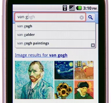
Today Google made good on their promise bringing the power of Google Instant search to the mobile space.  When you access Google.com and begin to type your query, the search bar snaps to the top of the screen and Instant does its thing.  The new functionality works over 3G and WiFi connections, but Google gives you the option to turn it off during those slow surfing times.  There’s a turn on/turn off button located beneath the search bar on the home page for easy access.

Instant for mobile is currently in beta, and it’s available for iPhone and iPod (running iOS4) and Android (running 2.2 Froyo) users in the U.S.  Additional country, language, and device support is in the works.  Look after the break to watch a brief demonstration.

[Via GoogleBlog] Continue reading Google Instant makes its way to mobile devices

Google Instant: search “faster than the speed of type”

Today Google announced a new, innovative, groundbreaking feature for Search.  Google Instant is predictive search; in other words, when you start typing a query into the Google Search bar, you will immediately be provided with results for the most likely search given what you have already typed.  This is extremely smart and intuitive.  Here’s an example.  If you type the letter “w”, Search will instantly predict the rest of the query–in this case, “eather” appears in gray letters because Search guesses you are going to type the word “weather”.  And since Search now has a predicted word to work with, results for “weather” will appear below the Search bar.  Results include websites, images, and local weather reports–the standard fare when searching such a query.  By typing a single letter, you can glance and scroll through search results, pretty extrodinary.  There’s no need to hit enter or select the Google search button.  Google calls it “search-before-you-type.”  In addition to the predictions, Google is also touting dynamic results and scroll to search.  The former feature is one you’re used to already;  as you type a query Search displays relevant results in a drop down menu directly below the Search bar.  As you move up and down this list highlighting various queries, Search will now provide you with results pertaining to the highlighted query in real time.

Google shares some interesting facts pertaining to the amount of time that is spend using search and how Google Instant will change all that.

  • Before Google Instant, the typical searcher took more than 9 seconds to enter a search term, and we saw many examples of searches that took 30-90 seconds to type.
  • Using Google Instant can save 2-5 seconds per search.
  • If everyone uses Google Instant globally, we estimate this will save more than 3.5 billion seconds a day. That’s 11 hours saved every second.

Google Instant is currently being rolled out to Google domains in the US, UK, France, Germany, Italy, Spain and Russia.  It is compatable with the following browsers:  Chrome, Firefox, Safari and Internet Explorer 8.  “Over the coming weeks and months” Instant will become “the core search experience” to users worldwide.  If you live in the US and have a Google account, sign in and you will be granted access to Instant.  Or click the try it now button here to go for a test run.  Once Instant becomes the standard and you’re not feeling it, you can disable it in Preferences.  Instant will make its way to mobile and the Chrome URL/Google search bar in the near future.  Look after the break for a Google Instant Q&A plus some introductory videos.

[Via GoogleBlog; Google Instant] Continue reading Google Instant: search “faster than the speed of type”

Google spruces up Images portal

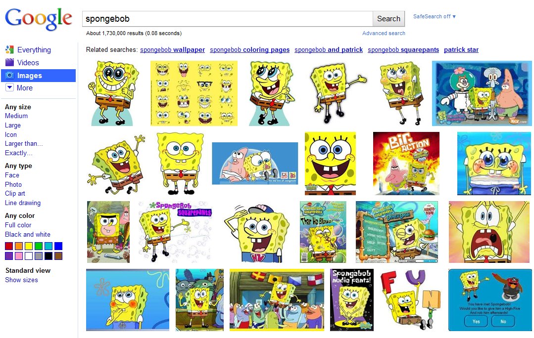
This week Google pushed out the most significant overhaul of Google Images since it was introduced way back in 2001.  The instantly recognizable cosmetic changes?  The portal has gone textless, opting for a tiled layout with instant scrolling.  When you input a keyword, Google will present 1,000 related images to you, allowing you to instantly scrub through the content without the hastle of clicking through various pages.  Since the text is gone, larger thumbnail previews result.  Where’d all the text go, you ask?  If you hover over a particular image, a “hover pane” will pop up and show you the image size, name, source, and Google’s “similar images” option.  When you click an image you are brought to a new landing page; the image will be produced on top of its source’s website.  When you click anywhere outside the image it disappears and reveals the source page so you can see exactly where it’s coming from.  Optimized keyboard navigation and Image Search Ads round out the updates.  Google is rolling out the new interface worldwide over the course of this week.  Check in now to see if you’ve got it.

[Via GoogleBlog]

Google is refreshing its search interface, give it a try

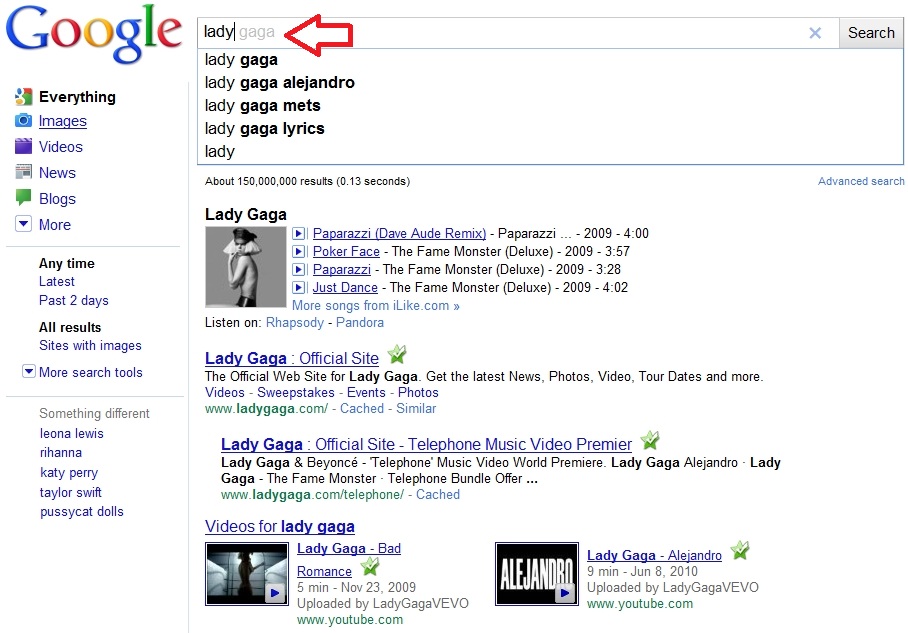
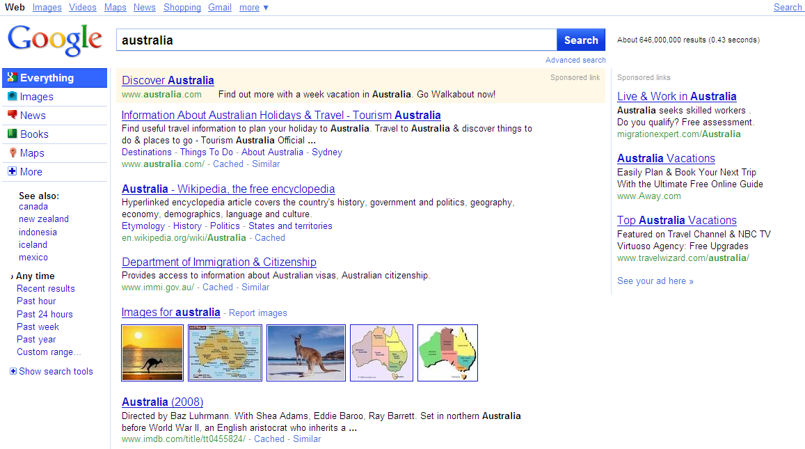
Looks like Google is finally giving its first-born a refresh.  At an unspecified date the main Google page and its search options will change in appearence.  The interface promises to be cleaner, bolder, and and more accessable.  Right now Google is testing out the new search features on random people.  You haven’t been invited to the party?  That’s OK, I’ve got the ticket to sneak you in the back entrance.  It’s all after the break.


[Via Gizmodo, here, here & here; SearchEngineLand]

Continue reading Google is refreshing its search interface, give it a try