Tag Archives: redesign

Apple September event roundup: New iPods, iTunes 10, refreshed Apple TV, iOS4 updates

Today Apple CEO Steve Jobs took the stage to announce a new lineup of iPods, the next version of iTunes, and a refreshed Apple TV.  He also talked about the next two iOS4 software updates.  Let’s dive right into it, shall we?

iPod shuffle: The redesigned fourth generation iPod shuffle brings back the clickable front-facing ring buttons (play/pause, previous, next, volume up, volume down) and keeps VoiceOver control (it speaks artist and song name, multiple playlists, and battery status in 25 different languages) and the back clip.  It now supports playlists and Genius Mixes.  The tiny sqaure casing includes the on/off/play in order/shuffle switch, a VoiceOver button, and a 3.5mm headphone jack for audio and USB charging.  The battery holds up to 15 hours of audio playback.  The shuffle will be available in 5 different colors (grey, blue, green, orange, and pink).  A 2GB model will start shipping in one week for $49.

iPod nano: The redesigned sixth generation iPod nano does away with the click wheel and adds a 1.54 inch (240×240) multitouch display.  It adopts the tiny iPod shuffle aesthetic; it’s even got the built-in back clip.  It is 46 percent smaller and 42 percent lighter than the previous nano model.  To navigate around the iOS-like touch interface, swipe left and right to access different pages of icons, up and down to scroll through lists, double tap to zoom in on photos (there is no pinch-to-zoom), and tap to access other areas.  Any time you want to go back to the home screen simply tap and hold anywhere on the screen (there is no home button).  You can even rotate the screen using two fingers.  You can customize the pages of icons by touching and holding an icon down until it jiggles then dragging it to the desired position.  Everything here should be very familiar to iPhone and iPod touch users; it’s all just miniturized.  The home screen gives you access to playlists, now playing, artists, and Genius Mixes.  Also available is an FM radio, Nike+, a clock, Voice Memo, and access to Photos, Podcasts, Settings, and music categorized by song, album, genre, and composer.  The small enclosure includes a sleep/wake switch and volume up and down buttons on top and the 30-pin dock connector and 3.5mm headphone jack on bottom.  It also has a built-in accelerometer and supports VoiceOver in 29 different languages.  The battery holds up to 24 hours of audio playback.  The nano will be available in 7 different colors (grey, blue, green, orange, pink, charcoal, and Product (RED)).  8GB ($149) and 16GB ($179) models will start shipping in one week.

iPod touch: The fourth generation iPod touch gets even closer in design and functionality to its iPhone cousin.  The new touch features the same 3.5 inch (960×640) Retina Display, Apple A4 processor, back camera, and  front-facing camera, and three-axis gyro sensor as the iPhone 4.  The back camera shoots HD (720p, up to 30fps) video that can be edited on the device with simple trimming (included) or with more advanced editing (the $4.99 iMovie app now supports the iPod touch); it can also shoot stills.  The front-facing camera can shoot stills and supports FaceTime chats over WiFi with other iPod touches and iPhone 4s.  The external buttons and input/output holes remain the same: sleep/wake switch, volume up and volume down, the home button, 30-pin dock connector, 3.5mm headphone jack, build-in speaker and microphone.  802.11n WiFi, Bluetooth 2.1, Nike+, accelerometer, ambient light sensor are still there as well.  The battery holds up to 40 hours of audio and 7 hours of video playback.  The touch will be available in polished aluminium on black only.  8GB ($229), 32GB ($299), and 64GB ($399) will start shipping in one week.

iTunes 10, Apple TV, iOS4 after the break ::   Continue reading Apple September event roundup: New iPods, iTunes 10, refreshed Apple TV, iOS4 updates

New Xbox 360 wireless controller features new D-pad, matte silver looks

Today Xbox’s Major Nelson showed off a newly designed Xbox 360 wireless controller.  Right off the bat you will notice the new color scheme.  The controller is now colored matte silver and the ABXY buttons have lost their vibrant colors (green, red, blue, yellow) to match the controller body.  The two analog sticks are slightly more concave now, too.  What you might not notice instantly in the pictures but you certainly will when the controller is in your hands is the brand new D-pad.  For years Xbox gamers have complained about the lack of a raised D-pad, but now this issue can be put to rest.  Microsoft has patented a “transforming D-pad”.  In the standard configuration the D-pad is a disc (that’s what we’re sued to).  With the new controller you can now twist the D-pad to raise the plus sign about a quarter-inch making it a whole lot more usable (especially for gamers who play boxing games where D-pad use is of the utmost importance).

—–>

The new controller will be available November 9 and will only be found inside the $64.99 Play & Charge Kit.  Microsoft has not stated if/when the new controller will replace the old model outside of the P&C Kit and whether or not it will ever be bundled in the new 250GB Xbox 360 package.  Look after the break to watch Major Nelson hold up the controller in all its gray glory.

[Via MajorNelson; Engadget]

Continue reading New Xbox 360 wireless controller features new D-pad, matte silver looks

$100 bill gets a makeover

On Wednesday officials unveiled a new design for the $100 bill.  Mr. Franklin joins pals Lincoln, Hamilton, Jackson, and Grant in the fight against counterfeiters.  The new $100 note includes the following security enhancements: A 3D Security Ribbon that nearly cuts the bill in half at the center contains images of bells and 100s that move and change from one to the other as you tilt the note.  The ribbon is woven into the paper, not printed on it.  The Bell in the Inkwell, located on the front of the bill to the right of Franklin, changes color from copper to green when the note is tilted, an effect that makes it seem to appear and disappear within the copper inkwell.  On the back there’s a new vignette of Independence Hall featuring the rear, rather than the front, of the building.  The Franklin portrait and the vignette have been enlarged and the oval around them has been removed.  Also on the back you’ll find a large gold 100; it helps those with visual impairments to distinguish the denomination.  The bill retains several enhancements from the last update including the portrait watermark, the security thread, and the color-shifting 100.  The new $100 notes will begin circulating on February 10, 2011.  Look in the gallery below to learn more about the visual security enhancements; after the break there’s a short animation that highlights the bill.    Welcome to the club, Franklin.  Washington, where you at?

[Via NewMoney]

Continue reading $100 bill gets a makeover

Twitter homepage gets a refresh

[homepage-screen.png]

Today Twitter pushed out a redesigned homepage.  It’s definitely more effective than previous implementations due to its friendly nature that will likely appeal to non-Twitter users who are looking to find out more about the community.  Trending topics and hashtags scroll along the top; what’s prominent now are the “see who’s here” and “top tweets” sections.  These sections give visitors a sense of who is adding to the conversation and what‘s being talked about in a bit more detail.  Twitter explains:

With the new design, we’re intentionally featuring more dynamic content on the front page, revealing a sample of who’s here, what folks are tweeting about, and the big topics that they’re discussing. The homepage now features a set of algorithmically-selected top tweets that automatically appear every few seconds. It also highlights a random sampling of suggested sources; hover over any of them to see a profile summary and their latest tweet. Trending topics now scroll across the page, allowing us to present a large set of trends using little page real estate. Hovering over some of these trends will show a description explaining why the keyword is (or has recently been) popular.

Now if there was only a way to get rid of all things Justin Beiber.

[Via TwitterBlog]

Facebook gets a redesign; Twitter is updated

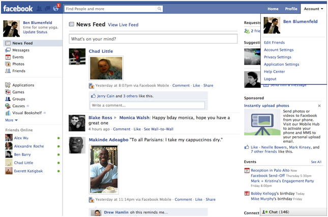
On Friday Facebook received a facelift; what else is new, right?!  It feels like the Facebook devs are constantly updating the site’s user interface.  Though having to re-learn how to navigate the site every few months is an annoying task, you have to remember it’s all being done to make the experience more streamlined and faster to get around.  So what does this latest redesign bring with it?  The Top Menu is the area where you’ll find your newest notifications, friend requests, and inbox messages in drop-down menu form.  The Left Menu brings together Messages, Events, Photos, and Friends all in one space.  An extension of your Friends List is also found here; it lists the people you chat with most and can be expanded to its usual spot in the bottom right-hand corner.  There have also been updates to the Applications and Games dashboards, making it easier to discover and play new apps.  The center of the page prominently features your News Feed.  All in all, since the redesign only affected the home page (your profile and friend’s profiles look and function the same) there isn’t much to re-learn.  In fact, I find the new look freshing and definitely a step up from their recent upgrades.  But that’s what it’s all about, right?  (Side note: This redesign comes on the heels of Facebook’s 6th birthday.)

Twitter’s update is not as drastic but it still brings a few welcome features.  Hovercards give users a new way to access profile information without having to leave the homepage to visit someone else’s profile page.  Twitter Spokesperson Jenna Sampson explains: “Hovercards are cards which appear when you hover over a username or avatar.  The cards display additional information about the person and allow you to interact with them while staying within the context of your page.”  Hovercards reveal the person’s name, profile information, location, and whether or not you follow the person.  You also get an options panel with follow, block, mention, or report buttons.  Less clicks and page redirections are the result.  A welcome update indeed.  Twitter is also giving users the ability to narrow the range of the Trending Topics list.  Instead of being forced into watching worldwide trending news, users can specify their country or US city.  They are currently working on adding more locations to the list.

For those of you who have not received the Facebook or Twitter updates yet there’s no need to worry.  It takes time for such updates to reach all users.  (I was one of the first to receive the Facebook redesign, but I have yet to play around with Hovercards in Twitter.)

[Via FacebookBlog; Mashable]

Coke can redesign; gets a grip, is roll-resistant

Designed by Dzmirty Samal.

According to PSFK.com: “Rather than use the traditional cold forming manufacturing process all cans undergo today, Samal’s concept makes use of a forming process called impact extrusion in which aluminum is pressed at a high velocity into a mold. Besides having a unique look, the faceted sides could make the can easier to grip and would prevent the can from rolling when placed on its side.”

[Via Gizmodo; PSFK]