Tag Archives: redesign

New changes coming to Facebook: the News Feed gets a “clutter-free” redesign

Heads up, Facebookers; there’s a new design update coming to the ubiquitous social networking site. Before it lands in your lap, get a quick overview of what to expect right here, right now.

After overhauling profile pages and search, Facebook’s next task is to revamp the News Feed by reducing clutter and making the site’s main portal even more personal. The site promises “you [will] see all the stories you saw in your News Feed before, but with a fresh new look.” Each story (or post) that your friends share will show up in your News Feed will be highlighted in new ways to make content discovery easier; for example, photos, news articles, maps, and events will appear larger and brighter and more colorful and vibrant. Also new is the addition of several feeds users can choose from. There’s a new drop-down menu in News Feed that allows you to dig deeper into specific content your friends are sharing. For example, the Photos feed filters out everything except for the photos your friends are posting; the Music feed tells you what your friends are listening to and provides you information about the artists you like; and the Following feed will show you the latest news from the Pages you like and the people you follow. Mark Zuckerberg says the enhanced News Feed aims to “give everyone in the world the best personalized newspaper we can.”

The new and improved News Feed is inspired by Facebook’s mobile presence. For example, the left-hand menu that users are used to exposing with a flick from the left-hand side of a tablet or smartphone’s screen will soon be accessible in desktop browsers. Also, users will have the ability to jump right to the top of News Feed whenever new stories trickle in. The main reason for porting over these mobile functions is to unify the overall Facebook experience across all devices. The “same clean look” will soon be present on our phones, tablets, and desktop browsers.

When is “soon” exactly? Facebook isn’t providing a hard date for the switchover, but the new News Feed will slowly roll out over the coming weeks on web and mobile, so says the company. If you’re itching to get your hands on the new design, you can join the feature’s waiting list right here; that site will also give you a visual rundown of it all. Facebook employees discuss the inspiration and vision for the News Feed redesign in a brief video embedded after the break.

[Via Facebook 1, 2] Continue reading New changes coming to Facebook: the News Feed gets a “clutter-free” redesign

Sony outs redesigned PlayStation 3, and other announcements from TGS 2012

At this year’s Tokyo Game Show, Sony announced a new smaller and lighter PlayStation 3. This marks the second time the PS3 has gone under the knife since its debut in 2006. Here are the most significant changes, according to the PlayStation maker:

Thanks to a complete redesign of the internal architecture, the volume and weight of the new PS3 has been reduced by more than half compared to the very first PS3 model with a 60GB HDD, and by 20% and 25% respectively compared to the current PS3. By adopting a sliding disk cover, the new PS3 continues with the characteristic sleek curved body design, which fits various places in the home and enables users to enjoy an array of entertainment content.

Starting September 25, Sony will sell the newly redesigned PS3 in a $269.99 bundle that includes a 250GB HDD, a copy of Uncharted 3: Drake’s Deception: Game of the Year Edition, and a voucher to download bonus content for the game DUST 514. About a month later on October 30, a 500GB varient will release and come bundled with Assassin’s Creed III; pricing is still TBD. A white version and one with 16GB Flash storage were also unveiled, but these are exclusive to Japan for now. Browse the gallery below for a closer look at the even slimmer PS3.

Also announced at TGS is that PlayStation Plus is coming to the PS Vita. If you’re already a member of Plus on the PS3, there will be no entry fee to port your status to the portable. If you’re a new subscribers you’ll be able to choose from two options: $18 for 90 days or $50 for one year. Plus features for Vita include an Instant Game Collection, discounts for games and DLC, online game storage, automatic updates and trophy sync. Plus for Vita launches this November.

Lastly, Sony announced that PlayStation Mobile is coming to smartphones and tablets on October 3. PSM promises to bring “PlayStation-like” game experiences to PlayStation-Certified devices. Said devices will come from partners like HTC, Fujitsu, Sharp, and of course Sony.

And in related PS news, the augmented reality experience known as Wonderbook will ship November 13. For $79 you get the hardcover Wonderbook that’s filled with AR codes, a PlayStation Eye camera and a Move controller, and the Wonderbook launch title featuring source material from J.K. Rowling Book of Spells. This bundle is all that’ll be available this year, but Sony says to look forward to next year when new Wonderbook titles Diggs: Nightcrawler, BBC’s Walking with Dinosaurs, and others from Disney will come out to play.

[Via PS Blog 1, 2, 3, 4]

Facebook Timeline now available worldwide

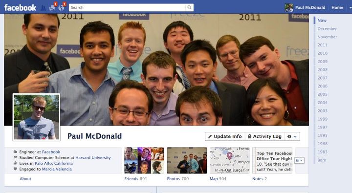
Mark Zuckerberg announced his social network’s redesigned profile page dubbed Timeline back in September at F8, Facebook’s developer conference. Just shy of three months later and Timeline is out of beta and now available worldwide for Facebook users to see and interact with. The new look is fully detailed at this previous post, and there are a few new things you should know about concerning the rollout of Timeline. Facebook is giving users a 7-day review period once Timeline is activated on an account. This means that you’ll have seven days to review everything that appears on your timeline before anyone else can see it. During this time you can feature and hide stories from your past and get your profile page looking just the way you want it before all your friends view it. Once your Timeline is ready, you can terminate the review period and publish your profile page manually; or you can simply let the week pass and it’ll automatically publish. Timeline is currently rolling out to all Facebook users. If you haven’t received the update yet and want it now, head over to Facebook’s “Introducing Timeline” site and click the Get Timeline button. The redesign is also available to view at m.facebook.com and on the Facebook app for Android. There is no ETA for when the update will reach iOS devices.

Update: That was quick. Facebook just rolled out a new version of the Facebook app for iOS devices (v4.1) and it brings the Timeline experience to iPhones and iPod touches. Timeline support for iPads is still listed as “coming soon.” Note that you will only see Timelines on your mobile device(s) if the feature has already been enabled on the desktop browser-based Facebook. The update also brings access to subscribers and subscriptions and performance improvements.

[Via Facebook]

Facebook redesigns profile pages with Timeline, partners with app developers to make things more social

Hot off the heels of updating the News Feed and adding the Ticker, Facebook’s Mark Zuckerberg announced more changes coming to the social network at today’s F8 developer conference.

Timeline

Your profile page is about to undergo an extreme makeover. The page is becoming wider to offer up more content at a glance and it will house three distinct sections: Cover, Stories, and Apps. Your Cover is dominated by an enlarged image, something that is separate from your profile picture and better expresses who you are. Your Cover can be personalized at any time and with any image you uploaded to Facebook. This section of the profile also shows off your About info (where you live, where you went to school, your job, your relationship status, etc.) and it also gives your friends a quick glance at your total number of friends, photos, likes, etc. Directly below that section is your Stories; this is an enhanced version of your Wall and it’s defined by an integrated Timeline. The Timeline makes it easier to highlight and go back to older posts. Up until the introduction of this new interface, the only way to see go back and see post from the past is to scroll all the way down to the bottom of your profile page and click “Older posts.” Users are forced to keep clicking that link to dig into the past. With Timeline, the past is easier to rediscover with the ability to highlight past memories that you don’t want people to forget happened so fast. All the content you ever posted on Facebook can be scrubbed through by date (month, year). And the Timeline is totally customizable; you can go back to a particular date and add events and pictures that you might have forgotten to post at the time they occurred. You can mark (or “star”) your favorite stories and these will expand to widescreen so your friends can see them more clearly. You can also remove the stories you want to hide. In addition to your Stories, the Timeline section of your profile page will also highlight apps.

Social apps

Facebook has offered apps in the past, but never like this. Zuckerberg and company have teamed with more than a handful of third-party developers to make apps more social on Facebook. Here’s an example: You’re an avid user of the new music streaming service Spotify and you’ve connected your Facebook account to your Spotify account. Since you’ve been using Spotify when it launched earlier this summer in the US, you’ve been listening to tunes and sharing what kind of music you listen to with your friends over Facebook. Today Facebook is bringing the listening and sharing experience to a whole new level. When you tell Spotify to share your listening habits to your Facebook friends, not only will they see what you are listening to but they’ll also be able to play the song directly within Facebook (granted your friends also signed up for Spotify). This will make music discovery simpler and definitely more social. And the world of social apps only begins with music. Facebook also partnered with major developers like Netflix, CNN, Kobo, and Foodily to make sharing what movies you’re watching, news and books you’re reading, and recipes you’re cooking a whole lot more engaging. The social apps you use regularly will show up in your friends’ News Feeds and Tickers and of course inside your profile page on your Timeline alongside the rest of your Stories.

In sum, Facebook wants your profile page to evolve into “the story of your life.” It will become the place where you and your friends can see what you’re all about and discover your life accomplishments as they happen. And with social apps, you and your friends will have greater access to sharing and engaging in conversation around similar interests you may never have known existed. Users tend to lambast Facebook for messing around with the interface on a regular basis, but it’s tough (at least for me) to deny the sheer amount of potential social apps have for the future of online interaction and discovery. And with Timeline, you won’t have to worry about your most exciting and interesting posts getting lost in the past. Of course, it’s tough to say how effective all of this is going to be without having played around with it. Facebook says social apps are rolling out today and the new profile design is going out to developers now and will slowly trickle out to all users soon. For now click here to view a sample “New Profile” and start getting used to the future of social networking.

[Via Facebook] Continue reading Facebook redesigns profile pages with Timeline, partners with app developers to make things more social

Facebook “improves” News Feed, Friend Lists; adds Subscribe Button and Ticker

Logged into Facebook recently? What was your reaction to the new look? Are you joining the bandwagon and hating on Zuckerberg and company for changing the ways things operate on the world’s most prolific social network yet again? Or maybe you are taking a liking to the new features just tacked onto the site. Whatever your feeling, it’s time you got used to these transformations in appearance and functionality. It’s not like you’re jumping ship and joining Google+ anytime soon (or are you?). Take my hand and let’s tour all of the “improvements” and additions Facebook integrated into the site almost overnight.

News Feed

The News Feed is no longer split up into two separate sections. Top Stories and Most Recent are now combined into one flowing, constantly updating list. Here’s how Facebook describes it: “All your news will be in a single stream with the most interesting stories featured at the top. If you haven’t visited Facebook for a while, the first things you’ll see are top photos and statuses posted while you’ve been away. They’re marked with an easy-to-spot blue corner. If you check Facebook more frequently, you’ll see the most recent stories first. Photos will also be bigger and easier to enjoy while you’re scrolling through.” Facebook considers “the most interesting stories” to be the status updates, photos, and links that are commented on most. When you see posts that interest you, there’s now an option to mark it as a “Top Story” and this is done by clicking blue corner. Tap it again and Facebook will say “We’ll try not to put more stories like this at the top of your News Feed.” In other words, you can teach Facebook what stories interest you from which friends and hide the ones that you don’t care to see. In sum, the updated News Feed will provide you with friends’ posts depending upon how frequently you visit the site.

The Subscribe Button

The new Subscribe button allows you to tweak exactly what you see in your News Feed. Facebook says you can use it to: “1. Choose what you see from people in News Feed; 2. Hear from people, even if you’re not friends; and 3. Let people hear from you, even if you’re not friends.” In your News Feed, you already see what your friends are posting; with the Subscribe button you can choose how much you see from them–“all updates,” “most updates,” and “important updates only.” Things can be broken down even further. You can decide what types of updates you see; for example, “you could see just photos from one friend, no stories about games from another, and nothing at all from someone else.” Simply hover your mouse over a story in your News Feed and a transparent arrow appears; click it to enter a drop down menu with Subscription settings. You can also subscribe to people you aren’t friends with, like musicians and political figures. If they have a Subscribe button on their profile page, click it and you will receive their public posts in your News Feed. If you want to add a Subscribe button to your profile and allow anyone to view your public posts, click here to activate it.

Friend Lists

Facebook has ripped a page from Google+’s playbook to improve the way users organize their friends. Much like Google+, Facebook has made it easier to add and place friends into specific categories, such as School and Work. “Smart lists” are created by Facebook and automatically group your friends together based on location, school, family, etc. For example, “if you list Boston College as a school you’ve attended and your friends John and Sarah do too, then you would instantly have a smart list called “Boston College” with John and Sarah on it.” Facebook has also created Close friends and Acquaintances lists; you can manage these lists yourself and place the appropriate people in them. The Restricted list is for your parents or bosses, people that you want to hide most of your content from; they will only see your Public posts. In fact, you can create as many lists as you like, edit them, and name them whatever you like. Very reminiscent of Circles, eh? Once a list is created, it will appear on the left-hand side of the webpage. When you click a list, your News Feed will show you top and recent stories only from the people in that list. Also, when you go to share a post you now have the option to share content specifically to one or more lists and only the people in them will see it. Facebook is making it easy to get your lists started. From now on when you go to add a new friend or accept a friend request, you will be prompted to add that person to a list (just like Google+ when it forces you to add a new friend to a Circle).

Ticker

In the top right corner of the webpage, directly integrated into the sidebar is a new feature called Ticker. In essence, it shows you all of your friends’ Facebook actions in real time. “Now when a friend comments, asks a question or shares something like a check in, you’ll be able to join the conversation right away. Click on anything in ticker to see the full story and chime in – without losing your place.” It’s a miniaturized version of the News Feed, and Facebook thinks it makes it easier and faster to see what your friends are up to and initiate conversations around their posts.

[Via Facebook 1, 2, 3] Continue reading Facebook “improves” News Feed, Friend Lists; adds Subscribe Button and Ticker

Sony rebrands and redesigns its retail shops–enter the Sony Store

Sony Style is a thing of the past. On April 1 Sony opened to the public the very first, totally redesigned Sony retail experience in Los Angeles and they’re calling–drumroll, please–the Sony Store. The press release details the new design quite nicely:

The new store was designed in collaboration with Klein Dytham architecture (KDa). It features a bright, open, inviting space, with products displayed on tables so that consumers can personally interact and engage with them like they would in a home environment. The layout of the store is flexible, with movable interior walls and changeable color schemes so that it can be adapted and reconfigured to highlight specific products, services, or content to engage and delight customers with fresh experiences each time they return.

The wide open store packs some really cool electronics, all made by Sony of course. Inside you’ll be able to interact with 3DTVs, 3D-capable Vaio laptops, PS3 games (with Move), digital cameras, Google TV, and so on and so forth. You’ll also spot the RayModeler, “a futuristic 360-degree display prototype that projects a 3D image that can be seen from all angles.” In the music section you can test out the Walkman and compare sound with Sony’s catalog of headphones; customers are allowed to test out the headphones on the Walkmans and their personal MP3 players. The TV section is walled with the latest and greatest Sony HDTVs and what’s neat is that every set’s price and specs are digitally labeled in the right-hand corner of each screen. And then there’s The Cube, a personal home theater dumped in the middle of the store.

The new Sony Store sounds like tech heaven, doesn’t it? Watch the video above to get a feel for the new design, and if you live in LA you can experience it first-hand by visiting the first rebranded store which is located at the Westfield Century City mall. In time all Sony Style retail locations will switch over to the new moniker, and the company plans on unleashing these new retail experiences nationwide and internationally after gaining customer feedback from the LA launch. Official PR after the break.

[Via Engadget] Continue reading Sony rebrands and redesigns its retail shops–enter the Sony Store

April Fools, 2011 edition: Rebecca Black takes over Funny or Die

Following the tradition of selecting an annoying teen sensation to take over their website, Funny or Die has chosen Rebecca Black (of “Friday” fame) for this year’s April Foolery. The site is designed all around young Rebecca; there’s even a calendar explaining that Friday is the day to be “so excited”, that Thursday comes before it, Saturday is tomorrow, and Sunday comes afterwards. Speaking of the day that starts the week, there’s a new featured trailer starring Rebecca called “Sunday Comes Afterwards” that’ll surely bust your gut with pain. And then there’s the excruciating “Which Seat Should I Take” PSA. There are more than a handful videos featuring Rebecca and you’ll find them all starring you in the face when you load up the redesigned site. But first, make sure you check out the video embedded above. In it Rebecca Black analyzes the lyrics to the genius song that made her popular in the first place. “Gotta have my bowl, gotta have cereal. That line is about consumerism. I gotta have my bowl, I gotta have my cereal.” And who knew they were so politically-bent? “The choice between the front seat and the back seat is actually a metaphor for American foreign policy.”

[Via Funny or Die]

April Fools, 2011 edition: Hulu’s gone all 1996 on us

In honor of April Fools Day the team at Hulu has redesigned the video streaming website to show what it would have looked like if it existed way back in the dial-up days of 1996. Notice the basic text, HTML frames, the page counter (stuck at 54), a “Sign our Guestbook” button (that brings you to the Simpsons episode “April Fools Origin”), shoutouts to Netscape Navigator, Internet Explorer, and the currently under construction Geocities neighborhood notice. Shows like The X Files and Sliders take center stage at the top of the page. And I won’t tell you what happens when you go to play a video. Find out for yourself at Hulu.com.

Your Facebook profile page is about to receive yet another facelift

Another day, another Facebook revamp–am I right?  Though most people love to share their gripes about Facebook’s incessant need to change the way it looks, this particular change to our profile pages is actually (and I can’t believe I’m saying this) a good one.  Read on to find out why.

When you receive the profile page update and head over to your page, the first change you’ll notice is up top where your name is located.  Tabs are gone (they’ve been moved to the left-side pane, but more on that later) and under your name now you’ll find “a quick summary of who you are”, as Facebook so eloquently describes it.  What looks like a jumble of words at first is actually a list of key information pertaining to you.  For example, if you provide info. like your relationship status, where you go to school and what you’re studying, where you live, where you’re originally from, where you work, what languages you speak, and your birthday–all of this will be listed under your name and viewable by friends.  Directly beneath this “about me” section is a collection of recently tagged photos featuring you.  Keep in mind these highlighted photos are static; you cannot change the order of them.  All you can do is tap a small “x” to hide a particular recent photo and it will be replace by the next most recent tagged photo. Pretty cool way to “show what you’ve been up to lately”, I guess. Continue reading Your Facebook profile page is about to receive yet another facelift

Xbox.com is getting a facelift, Avatar customization & WP7 support on the way

Xbox’s Major Nelson announced that Xbox.com will be undergoing a “massive facelift” tomorrow evening.  Besides the UI overhaul, the redesign promises to include support avatar customization and Windows Phone 7 games support.  Straight from the source:

  • Browser based Avatar editor: Edit your avatar and preview avatar items before purchase
  • Combined views for messages, friend and game requests
  • Improved notification of your account subscription
  • Leverage Family Reports to understand what your family is doing and how they are using LIVE
  • Play web games with your Xbox LIVE friends on the web or on Windows Phone 7
  • Marketplace: More powerful search and more intuitive ways to browse and filter

The website will be down for maintenance tomorrow, October 20 at 5PM ET and when it comes back you can expect to explore all these exciting new features.  For now, look in the gallery below for a sneek peek.

[Via MajorNelson]

Twitter homepage redesign on the way

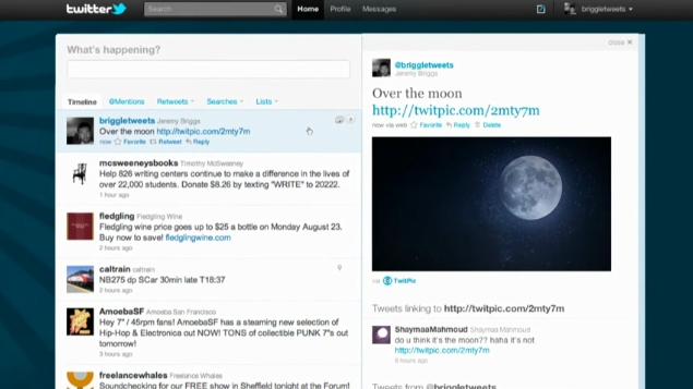
Earlier this week Twitter announced that a homepage redesign is coming to a browser near you.  The new design is built around a two column style, a look that is reminiscent of many Twitter apps for mobile devices.  On the left side resides your timeline of tweets.  The timeline features infinite scrolling, meaning you won’t have to click a “more” button to view older tweets.  @mentions, retweets, searches, and lists are housed directly above the timeline “creating a single, streamlined view on the left of the screen.”  And above all that sits the “what’s happening now” status bar.  On the right side you can view personal account information such as tweet count, your most recent tweet, your list of followers and who you are following, favorite tweets, the lists you are on, suggestions for who to follow, and the trending topics.  Along the very top of the site is the search bar and links for home, profile, messages, compose a new tweet, and account settings.

Other than showing your personal information, the right column is also used to present contextual info and embedded media from tweets.  When you click a tweet from your timeline, additional information related to the author and subject of the tweet shows up in the right column.  Twitter has teamed up with a bunch of social media sites (including DailyBooth, DeviantART, Etsy, Flickr, Justin.TV, Kickstarter, Kiva, Photozou, Plixi, Twitgoo, TwitPic, TwitVid, USTREAM, Vimeo, yfrog, and YouTube) so that when you click a person’s tweet in your timeline, an attached image or video will instantly appear in-line in the right column; no more clicking links and being forced to view media content in a separate portal.  And if a tweet is geotagged with a location, a miniturized map will show up in the column too.

Now don’t go too crazy.  The 140 character limit and all integral aspects of Twitter are staying the same.  This is purely a relaunch of the site design to make things more streamlined and accessable.  The new Twitter is currently being rolled out as a preview to limited number of users.  The redesign will be pushed out to all users “eventually.”  It shant be too long I presume.  Look after the break to watch an introductory video.

[Via TwitterBlog; NewTwitter] Continue reading Twitter homepage redesign on the way