Today Microsoft unveiled the next version of Windows; internally it’s being appropriately referred to as Windows 8. Microsoft’s goal with this iterative update is to bring one unified Windows experience to all kinds of platforms, including desktops, laptops, ultraportables, netbooks, and tablets. Note that this approach is fundamentally different from Apple’s; that camp separates Mac OS X and iOS as two different experiences and user interfaces–one is built around keyboard and mouse implementation, while the other is tailor-made for touch input. Microsoft says that the next version of Windows is being built with both methods of input in mind.
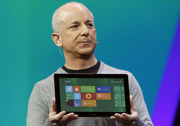
Take a look at the new Start screen pictured above. The Metro theme from Windows Phone 7 and hints of Windows Media Center should instantly be recognized here. The new Start screen replaces the classic Windows Start menu and is populated with live tiles. The tiles work in a similar manner to what you’d find on a WP7 device; they are in fact live and with an Internet connection provided they will always show up-to-date information such as notifications for email and weather reports. The Start screen is where apps will live, including Internet Explorer 10 which will feature fully touch-optimized browsing. Microsoft is going to provide developers with tools and APIs to create apps that can properly live inside this new touch-based environment. Standard web technologies such as HTML5 and Javascript will be the primary tools to make the magic happen.
During the demonstration Microsoft did not dive all that deep into the flashy new UI but here are a few things to know. When you power up a Windows 8 device you’ll see a lock screen that provides the date and time and some notifications; the lock screen background can be customized. Swipe up and you’ll be brought to the Start screen we’ve been discussing. Microsoft describes this customizable space as a “personal mosaic of tiles.” Every app you install to your device will exist as a tile. Click Weather and the app opens full screen. Multitasking is seamless. When multiple apps are open at once, simply swipe from the left to push background apps into the foreground. Switching from the browser to videos to pictures is extremely fluid and fast. Apps can also run alongside each other. For example, if you’re watching a video and want to check on your Twitter feed, a subtle swipe from the left will snap your Twitter feed to the left pane so you can check it out and continue watching your video simultaneously. If you’re on a tablet or slate device a virtual keyboard will reveal itself when it’s needed. A standard keyboard can be replaced by a “thumbs layout” that splits the keyboard in two and makes it more ergonomically friendly for tablet users whose hands are grasping the device from the sides. Also, no matter where you are a swipe from the right will show a pane consisting of Search, Share, Start, Connect, and Settings.
Ready for an unfortunate surprise? The new interface discussed here is, at its core, an OS skin of sorts. The regular Windows desktop and file system you’re used to exists behind the flashy overhaul. During the demonstration Microsoft Excel was initiated from the tile experience and was instantly opened inside the traditional Windows experience–desktop, Start menu, taskbar and all. Since Windows 8 will be a hybrid experience consisting of the new touch-based UI and the traditional Windows interface there will be a divide when it comes to app development; devs will have the option to make an app for the new space, the old space, or both. What’s neat, however, is that “flashy” apps can run alongside “traditional” apps. For example, you can have a Word document open and swipe in from the left a Twitter or RSS feed at any time. Also demoed was the ability to explore app content from multiple locations within the OS. For example, pictures can be viewed from the local file system, connected networks, and other apps on the system. The thought of running two distinct UIs at the same time is a bit scary, but at least Microsoft is doing its best to tie them together effectively.
And now let’s bring things full circle. As stated earlier, Windows 8 is meant to bridge the gap between desktop and mobile device, to create one seamless and connected experience across multiple platforms. Whether you’re using a keyboard and mouse or your fingers the next Windows will work. Apps will be designed from the ground up to be touch-capable (as is the OS), but Microsoft reassures that traditional keyboard and mouse input will work just fine. The upcoming OS will work with both x86 and ARM processors; Microsoft has teamed with NVIDIA, TI, and Qualcomm so far on that front. The company promises that hundreds of millions of developers will already know how to develop for it by the time it releases. Speaking of which, don’t expect to see Windows 8 running on your machine anytime soon. First Microsoft has to teach developers how to make apps for the new UI; this will happen at their upcoming developer event BUILD this September in California. At that time more details surrounding the upcoming OS will likely come out. Obviously a solid release window has not been announced yet, let alone a final name for the product. Microsoft let on that consumers and businesses should not anticipate a fall release.
That about does it for now. Essentially today’s unveil was just that–Microsoft lifted the curtains to reveal the flashy aesthetic of its new OS and showed how brilliantly it performs on tiny ARM processors. Hang tight, September is just three months away! Go on and jump after the break to watch a brief demonstration of Windows 8.
[Via Microsoft] Continue reading Windows 8 unveiled →


