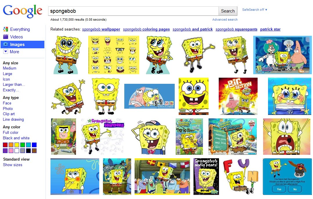
This week Google pushed out the most significant overhaul of Google Images since it was introduced way back in 2001. The instantly recognizable cosmetic changes? The portal has gone textless, opting for a tiled layout with instant scrolling. When you input a keyword, Google will present 1,000 related images to you, allowing you to instantly scrub through the content without the hastle of clicking through various pages. Since the text is gone, larger thumbnail previews result. Where’d all the text go, you ask? If you hover over a particular image, a “hover pane” will pop up and show you the image size, name, source, and Google’s “similar images” option. When you click an image you are brought to a new landing page; the image will be produced on top of its source’s website. When you click anywhere outside the image it disappears and reveals the source page so you can see exactly where it’s coming from. Optimized keyboard navigation and Image Search Ads round out the updates. Google is rolling out the new interface worldwide over the course of this week. Check in now to see if you’ve got it.
[Via GoogleBlog]