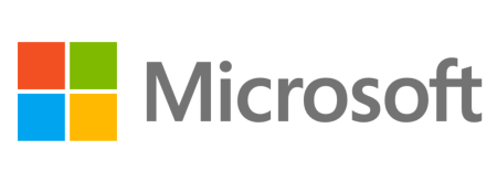
Take a gander at Microsoft’s brand new logo. Shortly after revealing the Windows 8 logo, Microsoft is revamping its corporate image with this modern look that incorporates a grey logotype (the name Microsoft) and a multicolored symbol (the red-green-blue-yellow flattened window). The branding “signal[s] the heritage but also signal[s] the future–a newness and freshness,” says Microsoft’s general manager of brand strategy Jeff Hansen. This marks the fourth time the Windows makers redesigned their logo, and the first time in 25 years. With Windows 8, Windows Phone 8, and Office 2013 on the horizon (and Xbox matching its Dashboard to the desktop/laptop/tablet and mobile OS’), there really hasn’t been a better time for Microsoft to pull this off. Me likey; what do you think of the fresh new look? Hop after the break to see all of MS’ brands animate.
[Via Microsoft; The Seattle Times] Continue reading Microsoft shows off first new logo in 25 years