Category Archives: Technology

SlingPlayer is now available for Android Honeycomb tablets

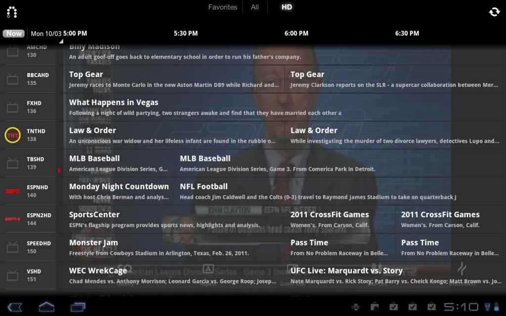
A little under a month after previewing it, Sling Media has released its SlingPlayer for Android Honeycomb tablets. Just like the iOS and Windows Phone 7 versions that came before it, this one costs $29.99. A press release, in full after the break, clarifies: The SlingPlayer application for Android Phones will continue to work in “Compatibility Mode” on tablets at no extra charge. The Android Phone version of the application streams from all Slingboxes, but not at the higher quality resolutions available on tablet devices. Go and get it at the Android Market today.

[Via Engadget] Continue reading SlingPlayer is now available for Android Honeycomb tablets

Apple announces iPhone 4S, refreshed iPods, & provides release date for iOS 5 & iCloud

On Tuesday newly appointed Apple CEO Tim Cook hosted a press event to launch the next iPhone and detail the new version of iOS and the upcoming iCloud service. Breakdown, commence.

iPhone 4S

The successor to the iPhone 4 is not the iPhone 5; it’s the iPhone 4S. It serves as an incremental upgrade to its predecessor much like the iPhone 3GS was to the iPhone 3G. The exterior design of the handset remains the same; the changes can be found on the inside. The 4S packs the same processor originally designed for the iPad 2: Apple’s dual-core A5 chip. The company says that users can expect speeds up to 2X faster than the previous iPhone. In addition, the 4S also contains a new dual-core GPU that renders graphics up to 7X faster than the iPhone 4. At the keynote games developer Epic previewed Infinity Blade 2 (out December 1) and it looks magnificent.

After speed, Apple went on to upgrade the device’s camera. The 4S sports a new 8 megapixel camera. The sensor has 60 percent more pixels allowing users to shoot 3264 x 2448 photos with crisp detail. CMOS backside illuminated allows for 73 percent more light, a hybrid IR filter allows for better color accuracy and uniformity, a five element lens setup allows for 30 percent more sharpness, auto white balance has been improved by 26 percent, and a larger f/2.4 aperture is now featured. Also, the Camera app launches much faster and the shot to shot capability is twice as fast as before; it now takes 1.1 seconds to shoot your first photo and then 0.5 seconds for each additional shot. According to Apple’s research, these speeds blaze past the Android competition. And there’s this: the backside camera shoots video in full 1080p HD resolution and features real-time video image stabilization and temporal noise reduction helps in low light conditions.

The phone’s antenna system has also been tweaked. The dual-antenna design of iPhone 4 remains, but now it can intelligently switch between both antennas to transmit and receive data more efficiently. This results in the device’s ability to download data up to twice as fast as before (HSDPA performance: 14.4 Mbps down, 5.8 Mbps up) and you can expect better call quality. The 4S is a world phone, meaning GSM and CDMA technologies are built in and users can roam internationally on both networks.

And then there was the “one more thing…” Apple announced Siri, the device’s “intelligent assistant that helps you get things done just by asking.” With the iPhone 4, holding down the home button will prompt the phone to initiate the rather crude voice-activated menu where you can say things like “Call Home” or “Play Kanye West.” Siri takes this to an entirely new level of awesome. Apple designed Siri to “understand context allowing you to speak naturally when you ask it questions.” Here are some examples to help illustrate. You can ask Siri “What is the weather like today?” and it will display the current temperature with visual aid. Then you can ask for an “hourly forcast” and it will provide that information, too. You can also say things like “Wake me up at 6AM”, “Find me a great Greek restaurant in Palo Alto”, “Give me directions to Hoover Tower”, and “Schedule lunch at Friday on noon with John Smith” and Siri will answer you intelligently. It will access the clock app to set an alarm; it will search the ‘Net for Greek restaurants and sort them by Yelp customer ratings; it will launch Maps and provide directions; and it will look into your calendar and create events for you (if there’s an event that clashes with the new one you’re attempting to make, Siri will inform you about this and ask if you want to reschedule one of them). And the hands-free interaction doesn’t end there. Siri has access to many of the apps preloaded on the 4S. You can make Siri read aloud your text messages and emails and it’s also integrated with Reminders, Safari (“Search Wikipedia for Neil Armstrong”) and Wolfram Alpha’s database (“Define mytosis”). An information pane inside the Siri interface will provide users with a list of prompts they can use. And when you ask Siri “Who are you?” it’ll answer “I am a humble personal assistant.” Ha, try it! It also does dictation; a new mic icon is now part of the virtual keyboard. Siri is an iPhone 4S exclusive, and it works over WiFi and 3G. At launch it’ll remain in beta and support English, French, and German; Apple promises over time additional languages and services will be added.

The iPhone 4S, which will ship with iOS 5 and iCloud services, releases October 14 and is now available for preorder. It’ll sell in black and white flavors at the following price points: 16GB: $199, 32GB: $299, 64GB: $399, all with new two-year contracts of course. Additionally, Sprint joins AT&T and Verizon Wireless to become a carrier of the iPhone. (Note that the iPhone 4 will continue to sell at a new low price point of $99 (8GB) and the iPhone 3GS (8GB) can be picked up at no cost. When the 4S ships on the 14th it’ll release in the US, Canada, Austrailia, the UK, France, Germany, and Japan; on the 28th it’ll make it’s way to 22 more countries and by December 2011 it’ll sell in over 70 countries and with over 100 carriers. Apple claims this’ll be the fastest rollout ever for an iPhone.

iOS 5, iCloud, and iPods after the break. Continue reading Apple announces iPhone 4S, refreshed iPods, & provides release date for iOS 5 & iCloud

Rest in peace, Steve

Shortly after stepping down as CEO of Apple, Steve Jobs passed away on October 5 at the age of 56. Newly appointed CEO Tim Cook released this statement to Apple employees:

Team,

I have some very sad news to share with all of you. Steve passed away earlier today.

Apple has lost a visionary and creative genius, and the world has lost an amazing human being. Those of us who have been fortunate enough to know and work with Steve have lost a dear friend and an inspiring mentor. Steve leaves behind a company that only he could have built, and his spirit will forever be the foundation of Apple.

We are planning a celebration of Steve’s extraordinary life for Apple employees that will take place soon. If you would like to share your thoughts, memories and condolences in the interim, you can simply email rememberingsteve@apple.com.

No words can adequately express our sadness at Steve’s death or our gratitude for the opportunity to work with him. We will honor his memory by dedicating ourselves to continuing the work he loved so much.

Tim

The company has signified the passing of Steve at www.apple.com by stripping the homepage of all products and replacing it with an enlarged picture of the innovative leader, his name, and the years 1955-2011. Clicking this image brings you to a new portal www.apple.com/stevejobs that contains a part of Cook’s message and a way to share your thoughts, memories, and condolences with the company and Steve’s family.

Rest in peace, Steve. Thanks for inspiring to think different and transforming the world into a better place. Your contribution to society will reign for all time.

Amazon unveils new e-Reader lineup: Kindle, Kindle Touch & Kindle Fire

On Friday Amazon CEO Jeff Bezos introduced the e-tailer’s brand new e-Reader lineup: the $79 Kindle, the $99 Kindle Touch, and the Kindle Fire at $199.

The latest generation base Kindle is lighter, smaller, faster, and cheaper than ever. It features a new design that is 30 percent lighter than its predecessor at 5.98 ounces, 18 percent smaller, and it turns pages 10 percent faster. Its still got a 6-inch electronic ink display. The device has four buttons on its front: back, on-screen keyboard, menu, home, and a directional pad. On either side are buttons for page-turning. But there’s no physical keyboard and no touch. There’s a reason why it’s being sold at such a low price–this Kindle is the definition of bare bones. If all you need to do is read (and you don’t mind using a directional pad to navigate through menus) this is the e-Reader for you. The Kindle is available for purchase today.

An extra $20 will get you the Kindle Touch, a slightly upgraded version of the e-Reader that boasts a touch display. You won’t find any buttons or a physical keyboard on this bad boy; the user interface is solely based on touch. Like the base model, this Kindle is  lighter and smaller than before and it has an “extra-long battery life.” The Kindle Touch (also available with 3G built-in for $149) is now available to preorder, and it releases November 21.

And finally there’s the Kindle Fire, what Amazon describes as a “new class of Kindle.” It’s a tablet, really. So I betcha want to hear specs? The 14.6 ounce Fire packs a 7-inch LCD multitouch display with IPS and Gorilla Glass strength, 1GHz TI OMAP dual-core processor, 512MB of RAM, and 8GB of storage. Does that number seem low to you? Worry not! Amazon promises you’ll never have to think about storage space since you can save virtually all of your content in the cloud via the Amazon Cloud storage that’s connected to your Amazon account. All Amazon digital content is automatically backed up for free. Movies, TV shows, music, magazines and newspapers, Android apps and games, and of course books can be purchased and downloaded right on the device. Though the Fire runs on Google’s OS, Amazon has tweaked Android so much that it’s totally unrecognizable. In other words, it’s an experience you’ll only get on this device. One feature users will be privy to is the Fire-exclusive web browser called “Amazon Silk.” The company describes it as a “split browser” architecture that makes for a faster web browsing experience. And just like its E-reader brethren, the tablet uses Amazon’s Whispersync technology to automatically sync your Kindle library, last page read, bookmarks, notes, and highlights across a variety of devices. The Kindle Fire will sell for a low $199 when it hits the market on November 15.

Inspect the devices in the galleries hanging above. Read through the beefy press release after the break. Continue reading Amazon unveils new e-Reader lineup: Kindle, Kindle Touch & Kindle Fire

Facebook redesigns profile pages with Timeline, partners with app developers to make things more social

Hot off the heels of updating the News Feed and adding the Ticker, Facebook’s Mark Zuckerberg announced more changes coming to the social network at today’s F8 developer conference.

Timeline

Your profile page is about to undergo an extreme makeover. The page is becoming wider to offer up more content at a glance and it will house three distinct sections: Cover, Stories, and Apps. Your Cover is dominated by an enlarged image, something that is separate from your profile picture and better expresses who you are. Your Cover can be personalized at any time and with any image you uploaded to Facebook. This section of the profile also shows off your About info (where you live, where you went to school, your job, your relationship status, etc.) and it also gives your friends a quick glance at your total number of friends, photos, likes, etc. Directly below that section is your Stories; this is an enhanced version of your Wall and it’s defined by an integrated Timeline. The Timeline makes it easier to highlight and go back to older posts. Up until the introduction of this new interface, the only way to see go back and see post from the past is to scroll all the way down to the bottom of your profile page and click “Older posts.” Users are forced to keep clicking that link to dig into the past. With Timeline, the past is easier to rediscover with the ability to highlight past memories that you don’t want people to forget happened so fast. All the content you ever posted on Facebook can be scrubbed through by date (month, year). And the Timeline is totally customizable; you can go back to a particular date and add events and pictures that you might have forgotten to post at the time they occurred. You can mark (or “star”) your favorite stories and these will expand to widescreen so your friends can see them more clearly. You can also remove the stories you want to hide. In addition to your Stories, the Timeline section of your profile page will also highlight apps.

Social apps

Facebook has offered apps in the past, but never like this. Zuckerberg and company have teamed with more than a handful of third-party developers to make apps more social on Facebook. Here’s an example: You’re an avid user of the new music streaming service Spotify and you’ve connected your Facebook account to your Spotify account. Since you’ve been using Spotify when it launched earlier this summer in the US, you’ve been listening to tunes and sharing what kind of music you listen to with your friends over Facebook. Today Facebook is bringing the listening and sharing experience to a whole new level. When you tell Spotify to share your listening habits to your Facebook friends, not only will they see what you are listening to but they’ll also be able to play the song directly within Facebook (granted your friends also signed up for Spotify). This will make music discovery simpler and definitely more social. And the world of social apps only begins with music. Facebook also partnered with major developers like Netflix, CNN, Kobo, and Foodily to make sharing what movies you’re watching, news and books you’re reading, and recipes you’re cooking a whole lot more engaging. The social apps you use regularly will show up in your friends’ News Feeds and Tickers and of course inside your profile page on your Timeline alongside the rest of your Stories.

In sum, Facebook wants your profile page to evolve into “the story of your life.” It will become the place where you and your friends can see what you’re all about and discover your life accomplishments as they happen. And with social apps, you and your friends will have greater access to sharing and engaging in conversation around similar interests you may never have known existed. Users tend to lambast Facebook for messing around with the interface on a regular basis, but it’s tough (at least for me) to deny the sheer amount of potential social apps have for the future of online interaction and discovery. And with Timeline, you won’t have to worry about your most exciting and interesting posts getting lost in the past. Of course, it’s tough to say how effective all of this is going to be without having played around with it. Facebook says social apps are rolling out today and the new profile design is going out to developers now and will slowly trickle out to all users soon. For now click here to view a sample “New Profile” and start getting used to the future of social networking.

[Via Facebook] Continue reading Facebook redesigns profile pages with Timeline, partners with app developers to make things more social

Facebook “improves” News Feed, Friend Lists; adds Subscribe Button and Ticker

Logged into Facebook recently? What was your reaction to the new look? Are you joining the bandwagon and hating on Zuckerberg and company for changing the ways things operate on the world’s most prolific social network yet again? Or maybe you are taking a liking to the new features just tacked onto the site. Whatever your feeling, it’s time you got used to these transformations in appearance and functionality. It’s not like you’re jumping ship and joining Google+ anytime soon (or are you?). Take my hand and let’s tour all of the “improvements” and additions Facebook integrated into the site almost overnight.

News Feed

The News Feed is no longer split up into two separate sections. Top Stories and Most Recent are now combined into one flowing, constantly updating list. Here’s how Facebook describes it: “All your news will be in a single stream with the most interesting stories featured at the top. If you haven’t visited Facebook for a while, the first things you’ll see are top photos and statuses posted while you’ve been away. They’re marked with an easy-to-spot blue corner. If you check Facebook more frequently, you’ll see the most recent stories first. Photos will also be bigger and easier to enjoy while you’re scrolling through.” Facebook considers “the most interesting stories” to be the status updates, photos, and links that are commented on most. When you see posts that interest you, there’s now an option to mark it as a “Top Story” and this is done by clicking blue corner. Tap it again and Facebook will say “We’ll try not to put more stories like this at the top of your News Feed.” In other words, you can teach Facebook what stories interest you from which friends and hide the ones that you don’t care to see. In sum, the updated News Feed will provide you with friends’ posts depending upon how frequently you visit the site.

The Subscribe Button

The new Subscribe button allows you to tweak exactly what you see in your News Feed. Facebook says you can use it to: “1. Choose what you see from people in News Feed; 2. Hear from people, even if you’re not friends; and 3. Let people hear from you, even if you’re not friends.” In your News Feed, you already see what your friends are posting; with the Subscribe button you can choose how much you see from them–“all updates,” “most updates,” and “important updates only.” Things can be broken down even further. You can decide what types of updates you see; for example, “you could see just photos from one friend, no stories about games from another, and nothing at all from someone else.” Simply hover your mouse over a story in your News Feed and a transparent arrow appears; click it to enter a drop down menu with Subscription settings. You can also subscribe to people you aren’t friends with, like musicians and political figures. If they have a Subscribe button on their profile page, click it and you will receive their public posts in your News Feed. If you want to add a Subscribe button to your profile and allow anyone to view your public posts, click here to activate it.

Friend Lists

Facebook has ripped a page from Google+’s playbook to improve the way users organize their friends. Much like Google+, Facebook has made it easier to add and place friends into specific categories, such as School and Work. “Smart lists” are created by Facebook and automatically group your friends together based on location, school, family, etc. For example, “if you list Boston College as a school you’ve attended and your friends John and Sarah do too, then you would instantly have a smart list called “Boston College” with John and Sarah on it.” Facebook has also created Close friends and Acquaintances lists; you can manage these lists yourself and place the appropriate people in them. The Restricted list is for your parents or bosses, people that you want to hide most of your content from; they will only see your Public posts. In fact, you can create as many lists as you like, edit them, and name them whatever you like. Very reminiscent of Circles, eh? Once a list is created, it will appear on the left-hand side of the webpage. When you click a list, your News Feed will show you top and recent stories only from the people in that list. Also, when you go to share a post you now have the option to share content specifically to one or more lists and only the people in them will see it. Facebook is making it easy to get your lists started. From now on when you go to add a new friend or accept a friend request, you will be prompted to add that person to a list (just like Google+ when it forces you to add a new friend to a Circle).

Ticker

In the top right corner of the webpage, directly integrated into the sidebar is a new feature called Ticker. In essence, it shows you all of your friends’ Facebook actions in real time. “Now when a friend comments, asks a question or shares something like a check in, you’ll be able to join the conversation right away. Click on anything in ticker to see the full story and chime in – without losing your place.” It’s a miniaturized version of the News Feed, and Facebook thinks it makes it easier and faster to see what your friends are up to and initiate conversations around their posts.

[Via Facebook 1, 2, 3] Continue reading Facebook “improves” News Feed, Friend Lists; adds Subscribe Button and Ticker

Google+ is now in beta, available for all, improvements galore

Over the past 12 weeks Google’s new social network Google+ has been in “field trial” mode; the only way to gain access into it was by receiving an invite from Google or friends who were invited into the network early. Today all that changes. Google+ is now in beta and open signups are available for everyone. Simply point your browser to google.com/+ to see what all the fuss is about.

Over the course of the field trial, Google claims to have made 91 different improvements to the network. I will share with you the ones that Google finds most exciting.

  • The mobile version of Google+ getting an upgrade. Hangouts can now be initiated on the go. When you see an active Hangout in your stream, tap Join to enter it. As of right now Hangouts only supports Android 2.3+ devices with front-facing cameras, but Google promises that the feature will make its way to iOS soon. Update: The iOS update has arrived: link.
  • Also on the mobile front… Huddle is being renamed Messenger and it now supports photo sharing. Additionally you can now edit your profile photo, customize your notifications, and (on Android devices) you can move the Google+ app to SD storage to save space.
  • On the desktop version of Google+ the company has introduced Hangouts On Air. Users can broadcast and record video sessions; up to nine others can join your hangout (as usual); and here’s the new feature: anyone can watch your live broadcast.
  • Additional updates to Hangouts include: screensharing, sketchpad, shared Google Docs, and named Hangouts (“for when you want to join or create a public hangout about a certain topic”). Also, Hangouts APIs are now available for developers to fiddle with.
  • Search comes to Google+: “Just type what you’re looking for into the Google+ search box, and we’ll return relevant people and posts, as well as popular content from around the web.”

Click the source links to read about even more improvements, then login to your Google+ account and interact with ’em first hand.

[Via Google 1, 2]

Netflix splits in two: Netflix for streaming, Qwikster for DVD-by-mail

On Sunday Netflix CEO Reed Hastings posted an apologetic blog entry on the official Netflix Blog and uploaded a similarly themed video to the company’s YouTube channel to announced some big changes. First and foremost, in the coming weeks Netflix will be split into two separate entities: Netflix is being kept for streaming, and the new brand Qwikster will incorporate the DVD-by-mail service. Additionally, subscribers will be able to rent video games (Xbox 360, PlayStation 3, and Wii) from Qwikster; this will be available as an upgrade option at an additional charge, just like how the Blu-ray upgrade is handled.

So why is all this change happening? Hastings blames his own “arrogance” on it all. He believes that his lack of communication with customers before, during, and after the recent price hike is to blame for the negative backlash the company has witnessed from subscriber outrage, cancellations, and the plummeting of their stock on Wall Street. According to Hastings, the decision had to be made: “So we realized that streaming and DVD by mail are becoming two quite different businesses, with very different cost structures, different benefits that need to be marketed differently, and we need to let each grow and operate independently.”

Though the decision to break up Netflix into two pieces might make sense for the company, there really aren’t any benefits for the customer that I can think of. Netflix and Qwikster will each have their own domains and they will not communicate with one another. This means that queues and ratings will not carry over from one service to the other. That’s a major bummer. Every time you want to change billing information or your password, these things will have to been done twice since the two services are totally separate. All of these extra steps on the consumer end of things is going to make matters worse (read: not better) for subscribers. I get that Hastings thinks that by separating streaming and DVD-by-mail will help the company innovate faster, but in the long-run I cannot see this shift in branding working at all. And isn’t that name just plain stupid…Qwikster, ugh. Reminds us of failed Internet ventures like Friendster and Napster. Is the introduction of Qwikster a step in the wrong direction for Netflix? Time will tell, sooner rather than later I bet. It’s funny. Hastings admits that “DVD by mail may not last forever but we want it to last as long as possible.” This move to disintegrate DVD and streaming services, I think, will speed up that process leading to the demise of physical rentals.

Other tidbits to come out of the announcement… Hastings claims, “There are no pricing changes (we’re done with that!). Members who subscribe to both services will have two entries on their credit card statements, one for Qwikster and one for Netflix.” …Andy Rendich, the man in charge of DVD-by-mail for the last four years (he’s been with the company for twelve years), has been appointed CEO of Qwikster. …The DVDs will continue to ship in ” that distinctive red” envelope but branded with the Qwikster logo. …Hastings hints that, “The additional streaming content we have coming in the next few months is substantial.” (Good news there!) Watch Hastings’ video titled “An explanation and some reflections” after the break.

[Via Netflix] Continue reading Netflix splits in two: Netflix for streaming, Qwikster for DVD-by-mail

SlingPlayer is coming to Android-powered tablets

Android smartphone users have been slinging live TV to their devices via the SlingPlayer Mobile app for some time now. Now running through the pipeline is a Honeycomb version of the same app. That’s right: in the near future both Android-powered phones and (Android 3.0 and higher) tablets will be able to run SlingPlayer. The app upgraded for larger screens will go for the same price it always has: $29.99. Click here and sign up to be notified about its release. For now, prepare for the release by watching the video demonstration above.

[Via Engadget]

Microsoft details Windows 8 at BUILD 2011 conference

This week at its developer-focused BUILD conference in Los Angeles, Microsoft previewed Windows 8 in all its Metro glory and offered up new juicy details surrounding the upcoming sleek OS. Methinks they can be best presented in easily digestible bullet point format.

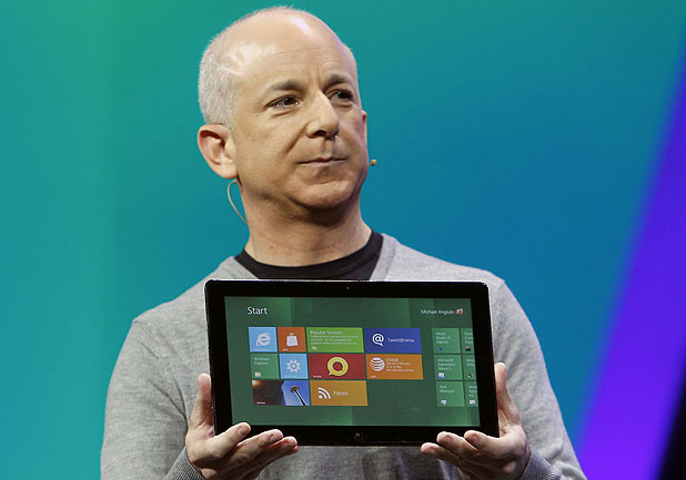
  • Windows 8 doesn’t require the latest and greatest and most powerful computer guts to run well. At the conference Microsoft’s President of Windows Steven Sinofsky (above) showed off a Lenevo S10 running Win8 without hiccup. The S10 is an ancient netbook released in 2008 with a single core 1.6GHz Intel Atom processor and 1GB of RAM, mind you.
  • Sinofsky also showed off not-yet-released ultra thin-and-light notebooks running Win8 smoothly. These “ultrabooks” of the future will have no problem powering the OS.
  • Win8 will come baked with NFC support. Microsoft demoed a tap-to-share feature whereby users can physically tap a tablet running Win8 to another compatible device and share information between the two devices. Just like HP’s “touch-t0-share” functionality between the TouchPad and other WebOS devices.
  • Xbox Live is coming to Windows. The company promises that this new service will bring the console’s games, music, movies, and TV shows to Win8 devices. (Click here to watch a demo)
  • The Windows Store (Microsoft’s version of Apple’s Mac App Store) will sell both Metro-style and conventional Windows apps.
  • Metro apps can communicate with one another so long as the developer builds that functionality in. Microsoft offers this example: “You can easily select and email photos from different places, such as Facebook, Flickr or on your hard drive.”
  • Windows SkyDrive support allows users to access content in the cloud across various Win8 devices with a Microsoft account.
  • The company has given a name to the pane that houses Search, Share, Start, Connect, and Settings. A swipe from the right brings up those aforementioned “Charms.”
  • The new OS will offer three different ways of logging into your account: password, PIN, or picture password. That last one is definitely the most innovative; you can select a picture from your collection and you will be asked to setup three touch points. When you go to login simply touch the predetermined points and you’re in!
  • Expect much, much faster bootup times. Depending on the type of hardware, going from completely off to the login screen could take as short as 3-5 seconds.
  • The ability to refresh and reset the OS from scratch is a new feature. If for any reason your system becomes corrupted due to, say, a virus you can wipe it out but keep all your settings in tact with a feature called Refresh. If things get really bad or you’re just looking to start anew again, Reset makes it easy to restore your OS to its original factory settings.
  • Last but certainly not least I want to talk about the core of Windows 8. Microsoft continues to reiterate that the new Metro UI and its Live Tile apps is not a skin on top of the classic Windows 7-esque desktop. At the conference the company demoed how users will easily be able to switch back and forth between the new UI and what Windows enthusiasts are used to. Think of it like this. The traditional Windows desktop with Start menu and Quick Launch bar lives next to (not underneath or above) the new UI. To access it users will tap or click the “Desktop” square that lives among the apps that make up the Metro UI. Want to download and engage with new HTML5-based apps? Stay inside Metro. Need to pull up a spreadsheet in Excel? You’re probably going to want to switch into the classic Windows mode. Let’s hope that Microsoft eventually ports their Office suite to Metro like Apple built an iOS version of iWork. Once that happens, your eagerness to return to the dark ages will quickly begin to dwindle. Microsoft is firm in its belief that Metro is the future for their PCs and smartphones; don’t be surprised if one day they completely phase out the Windows interface of yesteryear.
  • Update: Microsoft has announced that the Internet Explorer 10 running in Metro will not support any plug-ins. And that includes Flash. But why? Because they claim it “improves battery life as well as security, reliability, and privacy for consumers.” Don’t fret, though; IE10 running in the classic Windows app will support plug-ins as usual. Though Flash maker Adobe says they are ready and willing to “drive innovation in HTML5,” they will also be working hard to enable Flash-based apps in Metro via Adobe AIR.

Windows 8 is expected to release in 2012. But what if I told you there’s a way to get your hands on Windows 8 right now? The Windows Developer Preview is out now! So for all you app-makers out there excited to start building apps for the Metro interface, don’t wait another minute and click that link. And for those of you who are interested in learning more about Microsoft’s next big thing, check out the Windows unveiled article posted back in June. Microsoft’s plan to integrate Windows 8 across all kinds of devices (desktops, laptops, ultrabooks, and tablets running x86 and efficient ARM processors) is discussed in more detail there and after the break in PR form.

[Via Engadget 1, 2, 3, 4, 5, 6] Continue reading Microsoft details Windows 8 at BUILD 2011 conference

Windows Phone Mango coming to AT&T handsets this fall

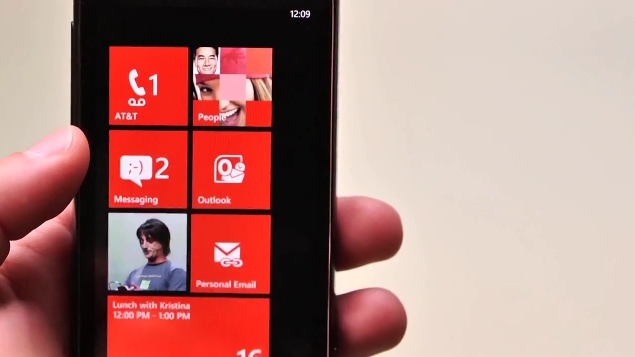
In May Microsoft previewed the first major upgrade to its rejuvenated mobile OS. Mango will bring multitasking, IE9, and deeper social network integration, among other things, to Windows Phone 7 devices. This fall, AT&T intends to upgrade their entire WP7 portfolio to Mango. Nice! But there’s more. In a press release (in full after the break), Ma Bell also announced three brand new handsets that will ship with Mango on board in Q4. The new and improved Samsung Focus S features a 4.3-inch Super AMOLED Plus display, 1.4GHz processor, a rear facing 8 megapixel camera and a front facing 1.3 megapixel, “4G”-capable speeds, and a thin profile at 8.55 millimeters. The Focus Flash downgrades things a bit and packs a smaller 3.7-inch Super AMOLED screen, a 5 megapixel camera with front facing camera, but it keeps the speedy 1.4 GHz processor. And finally the large-and-in-charge HTC Titan features a 4.7-inch display, 1.5 GHz processor, and 8 megapixel camera with dual LED flash. Pricing and exact available will have to wait.

Update: Microsoft shows off a bunch of Mango’s new features in dramatic video fashion after the break.

[Via AT&T; Engadget] Continue reading Windows Phone Mango coming to AT&T handsets this fall

Droid Bionic finally lands on VZW at $300

To say the launch of the Bionic has been a long time coming is quite the understatement. Motorola’s latest Droid handset was announced way back in January, and now–eight months later–it’s finally being sold at Verizon Wireless outlets everywhere. So the question on your mind right now should be: was it worth the wait? Check out these specs… The Droid Bionic is Verizon’s first dual-core and LTE-capable smartphone. It packs a dual-core 1GHz processor, 1 GB of RAM, 4.3-inch qHD screen featuring scratch-resistant Corning Gorilla Glass, an 8MP camera with AF, flash, and 1080p video capture, a front-facing cam for video chatting, 16GB on board memory and 16GB microSD card pre-installed, and HDMI out. It can serve as a Mobile Hotspot with up to five WiFi-enabled devices. This beast runs the latest version of Android–2.3.4 Gingerbread, that is. And it’s all jammed inside a slim 2.6(w) x 5.0(h) x0.4(d) shell weighing 5.6oz. Ah, what a mouthful. In short, if you’re a VZW customer and on the market for the latest and greatest and the best of both worlds (dual-core power and 4G LTE blazing speeds), the Bionic is a clear choice. How long it will remain on top is yet to be seen; I hear the iPhone 5 (4S?) is just around the corner.

Right–pricing. The Bionic runs a Benjamin higher than most smartphones. Order one today from VZW for $299.99 on a new two-year contract. Full PR sits after the break.

[Via VerizonWireless] Continue reading Droid Bionic finally lands on VZW at $300