Category Archives: Design

What if Tim Burton directed Disney’s classic movies?

That’s the question Russian artist Andrew Tarusov asked himself before putting pen to paper to produce this portfolio of gothic takes on classic Disney films. It’s always interesting to see artist’s renditions of cartoon characters with a Tim Burton twist, and this attempt is no less inspiring.

“I love how Burton’s style looks vintage, chic, and cute all at the same time,” Tarusov told HelloGiggles. “His work is often marketed as ‘horror’ movies, but at the same time, it’s not a horror… It could be any genre.”

Dive into the gallery below to see ten Disney movies reimagined if the shadowy mind behind The Nightmare Before Christmas and Coraline had his way with them. You may never look at Pinocchio and Dumbo–my personal favorites here–the same way again!

‘Tron: Legacy’ Light Cycle replica is fully-functional, beyond cool & ready for auction

Calling all Tron fans. Say what you will about the flashy sequel Tron: Legacy, but it’s hard to deny just how cool the flick is in the visual effects department. Perhaps the most bleeding cool thing from the movie is the modernized Light Cycle; see the original version here, and the updated model here. Now’s your chance to actually own a fully-functioning Light Cycle-inspired electric motorcycle. The Andrews Collection, a car collector, has completed production on the custom-made bike that entirely resembles the new Light Cycle as featured in Tron: Legacy. For all you moto enthusiasts out there, the bike features a 96 volt, direct-drive electric motor with lithium batteries and a computer-controlled throttle, rebound and compression damping with spring-preload front suspension and rigid rear suspension, and front and rear hydraulic brakes. It also sports a low seat height of 28.5 inches, making it easy to ride even at low speeds, says the Andrews family. The sleek replica is being prepared for an auction that will take place on May 2 and it’s expected to sell for anywhere between $25,000 and $40,000. Yep, that probably puts a damper on things for most of you, but that doesn’t mean you can’t fully take in the beauty that is this real-life Light Cycle.

Salivate in the gallery below, and just imagine how freakin’ rad it’d be to ride this thing around whilst blasting Tron: Legacy‘s Daft Punk soundtrack in the background. It’s fun to use your imagination!

Update (5/11): In case you were wondering, the Tron bike sold for $77,000. Crazy, huh? Perhaps for a die-hard Tron fan, maybe not so much.

[Via Engadget; RM Auctions]

Astronaut captures beautiful images of Earth, folds them into stunning time-lapse video

Fascinated by the vastness and wonderment of space that was presented in Cosmos: A Spacetime Odyssey? Then you have to check out this six-minute time-lapse video. Our beautiful planet Earth stars in the clip that’s actually made up of 12, 500 photographs taken by European Space Agency astronaut Alexander Gerst during his six-month stint in space aboard the International Space Station. While carrying out scientific experiences way up in the sky, Alexander smartly set cameras to automatically snap pictures at regular intervals. The result is what you see here: a spectacularly seamless and breathtaking look at our pale blue dot*.

*Blue Dot was the name of Alexander’s mission to space. And of course the ESA is borrowing that name from the late, great astronomer Carl Sagan; he was the creator and host of the original Cosmos series and he famously described Earth as “a pale blue dot.”

Bad Robot & Theory 11’s latest collab inspires you to “Send Wonder”

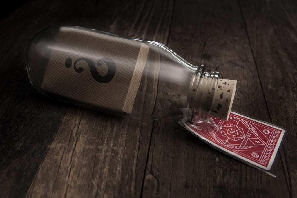
On Friday Bad Robot, again in collaboration with Theory 11, revealed a new “Mystery” product that serves as an extension of the previously announced Mystery Box. The new Mystery Bottle is an art piece handcrafted by artist and magician Jamie D. Grant. Theory 11 describes it as an “impossible object.” Have you ever seen a meticulously handcrafted ship stuffed inside a tiny bottle? Grant took this idea and made it all his own by “impossibly” inserting a regular deck of cards inside an unaltered solid glass milk bottle. Look at the image above; anyone can see that the deck of cards is clearly wider than the mouth of the bottle. You are free to shake the bottle as much as you want but you’ll find that the deck won’t budge and cannot be removed without breaking the bottle. Grant’s secret method remains a mystery of the best kind: one that truly inspires.

Following in the footsteps of J.J. Abrams’ TED talk that laid the groundwork for his Mystery Box, Grant too shares his story and inspiration behind his card deck in a bottle trick. Watch his brief yet stimulating TED presentation here and learn all about how his creation came to be and how his “Send Wonder” campaign altered his life and others for the better.

Grant’s Mystery Bottle–containing a sealed deck of Mystery Box Playing Cards embossed with the signature “?” symbol, naturally–is available for purchase today for $100 at Theory 11. 826 National, a non-profit that promotes creative writing in schools and workshops around the USA, is involved as $10 per bottle sold benefits the organization.

J.J. Abrams shares his inspired “Mystery Box”

If you haven’t seen J.J. Abrams’ TED Talk from March 2007, stop what you’re doing and watch it now. In it, the prolific filmmaker talks about his “mystery box.” When he was young his grandfather Harry Kelvin would take him to a magic store in New York City called Lou Tannen’s Magic. One day his grandfather bought him Tannen’s Mystery Magic Box, a box embossed with a giant question mark filled with $50 worth of magic tricks for the low price of 15 bucks. To this day, Abrams’ mystery box remains sealed and it sits on a shelf in his office at his production company Bad Robot. He reveals his reasons behind not opening it and keeping it after all these years: it represents his grandfather–an important figure in his life–and the notion of infinite possibility.

“…It represents infinite possibility. It represents hope. It represents potential. And what I love about this box, and what I realize I sort of do in whatever it is that I do, is I find myself drawn to infinite possibility and that sense of potential. And I realize that mystery is the catalyst for imagination… I started to think that maybe there are times when mystery is more important than knowledge.”

Think about to some of Abrams’ most prominent creations. Lost was one giant mystery box full of potential and engrossing enigma. Did we ever really need to know what the Island was or even represented? In the end, no, we did not; Lost was about a group of plane crash survivors finding salvation and hope in each other. Look at Cloverfield; Abrams unleashed an exciting campaign leading up to that monster movie by not revealing what the mysterious otherworldly creature actually looked like. And then there’s the dearly departed Fringe; that show was literally about infinite possibilities and holding onto hope in the worst of times.

Seven years after introducing that box on stage at TED, Abrams is releasing his very own mystery box for you to put up on your shelf. Bad Robot teamed up with Theory 11, an online source for high-grade magic products, to create and produce a handcrafted, wooden Mystery Lockbox. It’s made of 100-year-old reclaimed wood, the lid is iron-branded with the Mystery Box emblem (it’s a giant question mark undoubtedly inspired by Tannen’s box), and each box sold is locked with an alphanumeric combination lock. The Lockbox includes a letterpressed note from J.J. Abrams enclosed in a kraft paper envelope stamped with a black wax seal. The main contents of the box are 12 decks of Mystery Box Playing Cards and each deck is individually wrapped in letterpressed kraft paper. Art direction for the box and deck of cards are by Abrams and Theory 11’s Jonathan Bayme.

The Lockbox with the letter and 12 decks of cards is on sale now for $149.95. The cards are also sold separately at $9.95 per deck. Bad Robot will donate $1 per deck purchased to 826 National, a non-profit dedicated to promoting creative writing in schools and workshops around the America.

Now the decision remains: do you open the box or do you remain inspired by the mystery inside like Abrams does with his? Abrams, in his letter to Mystery Box owners, puts it like this: “The choice to open the box, or not, is yours.” Continue reading J.J. Abrams shares his inspired “Mystery Box”

Justin Timberlake and Macklemore & Ryan Lewis lead 2013 VMA nominations

We’re nearly approaching August and you know what that means: the MTV Video Music Awards is fast approaching. Justin Timberlake and Macklemore & Ryan Lewis lead with the most nominations for a Moonman this year with six apiece. JT’s “Mirrors” off his solid comeback album The 20/20 Experience and Macklemore & RL’s catchy “Thrift Shop” are in the running for Video of the Year along with Bruno Mars’ “Locked Out of Heaven,” Robin Thicke’s “Blurred Lines,” and T. Swift’s “I Knew You Were Trouble.” Close behind are Bruno Mars with four nods, and artists Pink, Robin Thicke, Miley Cyrus, and Thirty Seconds To Mars managed to pick up three nods each.

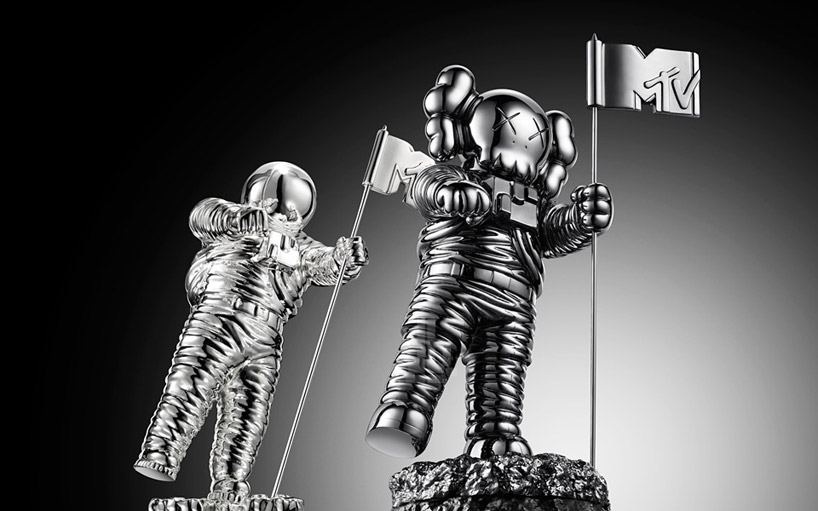
For 2013 the VMAs will air live on Sunday, August 25 from the Barclays Center in Brooklyn. To honor the new host venue, one of the borough’s most influential artists KAWS was asked to redesign for this year only the famous Moonman statue. It features his signature x’s for eyes, crossbones through the head, and puffy gloves for hands. No doubt artists will be clamoring for a win to claim the limited-edition, wickedly awesome trophy pictured above.

To view the full list of nominees, pop after the break. Continue reading Justin Timberlake and Macklemore & Ryan Lewis lead 2013 VMA nominations

Your first look at George R.R. Martin’s “real” Iron Throne

If you read the books and watch the show you might have two very different images in your head of how you perceive the Iron Throne. In case you didn’t know, the Iron Throne is the enormous pedestal the ruler of the Seven Kingdoms of Westeros sits upon when he reigns over the land and its people inside the world of George R.R. Martin’s A Song of Ice and Fire novels and the HBO series Game of Thrones. Martin addressed this matter this week in an explanatory blog post I will extrapolate here. In essence, Martin says it would not be possible to replicate his imagination’s version of the Throne. In his words:

The HBO throne has become iconic. And well it might. It’s a terrific design, and it has served the show very well. There are replicas and paperweights of it in three different sizes. Everyone knows it. I love it. I have all those replicas right here, sitting on my shelves. And yet, and yet… it’s still not right. It’s not the Iron Throne I see when I’m working on THE WINDS OF WINTER. It’s not the Iron Throne I want my readers to see. The way the throne is described in the books… HUGE, hulking, black and twisted, with the steep iron stairs in front, the high seat from which the king looks DOWN on everyone in the court… my throne is a hunched beast looming over the throne room, ugly and assymetric… The HBO throne is none of those things. It’s big, yes, but not nearly as big as the one described in the novels. And for good reason. We have a huge throne room set in Belfast, but not nearly huge enough to hold the Iron Throne as I painted it. For that we’d need something much bigger, more like the interior of St. Paul’s Cathedral or Westminster Abbey, and no set has that much room.

With the Iron Throne the process has been particularly frustrating. A dozen different artists have done versions of the Iron Throne over the years. Some have been very striking, some less so, but none of them have ever been quite RIGHT. Their versions never quite matched what I saw in my mind’s eye.

Until now. Artist Marc Simonetti “has come closer here to capturing the Iron Throne as I picture it than any other artist to tackle it,” admits Martin. “This Iron Throne is massive. Ugly. Assymetric. It’s a throne made by blacksmiths hammering together half-melted, broken, twisted swords, wrenched from the hands of dead men or yielded up by defeated foes… a symbol of conquest… it has the steps I describe, and the height. From on top, the king dominates the throne room. And there are thousands of swords in it, not just a few. This Iron Throne is scary. And not at all a comfortable seat, just as Aegon intended.”

Above, behold the real Iron Throne, or as close as we may ever see one. A more polished version of this work of art will be featured in Martin’s series companion book The World of Ice and Fire coming next year.


Great Scott! LEGO is coming out with a Back to the Future set

Dreams do come true. That’s right, LEGO is planning to release a Back to the Future set inspired by the classic 1985 film starring Michael J. Fox and Christopher Lloyd. The set found its feet in LEGO’s CUUSOO initiative. Besides creating their own original sets, LEGO accepts ideas from designers who think they can come up with the next best LEGO-based product. The BTTF set was one of four ideas uploaded to LEGO’s site; from there people could browse the prototypes and vote for their favorite one. After gaining 10,000 supporters, LEGO reviewed and considered it to become the next CUUSOO set to be sold in retail. Imagined by designers m.togami* and Sakuretsu (collectively known as Team BTTF), the Back to the Future Time Machine won and here is LEGO’s exciting announcement:

After analyzing the supporters of the Back to the Future project, we learned that this product has a broad, worldwide appeal. The model presented in this project is built very closely to the LEGO Group’s design standards and has therefore provided a strong base to design the final product. It has a high play value and it fits well with supporters’ price expectations.

For these reasons, the Back to the Future project has passed the LEGO Review, and has been selected for production as the next LEGO CUUSOO set. The final product, pricing, and release dates are still being determined.

To explore the other contenders in this round’s CUUSOO competition and to learn more about LEGO’s review process, click over to the company’s blog post. I’ve added some images of the prototype BTTF set in the gallery below; browse Team BTTF’s CUUSOO site to read more about their idea and to see more pictures. Keep in mind the final product may not look exactly like what you see here, but LEGO is working with the idea’s inventors so it’s OK to get a little giddy if you want. Video announcement after the break.

Though it may not be able to hit 88MPH, a LEGO Back to the Future Time Machine set is just what the Doc ordered.

Continue reading Great Scott! LEGO is coming out with a Back to the Future set

Fans vote for their favorite ‘Fringe’ events, grab inspired posters to benefit charity

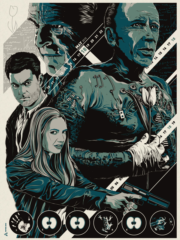
Do you want to own a piece of Fringe lore before the series comes to its epic conclusion? FOX, Gallery 1988, the Paley Center for Media, and The Mission Continues are teaming up to make that possible. The “Fringe Benefits Project” lets fans of the show vote for their favorite Fringe events and the top five moments will be reimagined by local artists and designers as pieces of art in the form of hand numbered limited edition poster prints. Once the five scenes have been selected, they will be showcased at Gallery 1988 in Los Angeles. The Paley Center for Media in Beverly Hills will also have the artwork on hand beginning January 9. Buy up the fan-made posters and all proceeds will be donated to The Mission Continues, a charity that encourages and aids volunteerism by disabled and wounded veterans.

To vote from 31 of the most memorable Fringe episodes, head over to the Fringe Benefits website. The first poster (pasted above) is already highlighted and it celebrates the complete awesomeness that was the season 2 episode “White Tulip.” The limited copy is yours for $30. Fringedom, have at it.

[Via EW]

In exposing the design origins of Windows 8, Jensen Harris gives a course in modernity

Even if you aren’t a Windows aficionado, you should take an hour out of your day to watch this. Jensen Harris, Director of Program Management for the Windows User Experience Team, took the stage at UX Week 2012, a user experience design conference. His presentation is called “The Story of Windows 8,” it details how Microsoft reimagined Windows for the next wave of PCs. He travels back in time to 1992, the year the Start Menu, Taskbar, and many of the other familiar facets of Windows were born. “They were designed to help people do things with computers that they did in 1992, not necessarily with what people do today with PCs, tablets, [and] phones today,” admits Harris. And this is what compelled the company to radically re-engineer the OS. Many things have been updated and refreshed over the years from Windows 95 to Windows 7, but “the basic elements of the user interface have remained the same,” he explains. Instead of waiting to be engulfed by the modern, his team decided to reimagine Windows by defining what is modern.

Over the course of the presentation, Harris gives a grand tour of Windows 8, interweaving and fully detailing the OS’ design principles (namely do more with less, authentically digital, pride in craftsmanship, fast and fluid, win as one).

He makes it a point to highlight the progression of Windows and what makes the latest release stand out from all the others. But what’s most fascinating about this intellectual and informative presentation is its overall theme which Harris calls “familiar usurped by modern.” Before diving into the OS, he spans the video game, smartphone, and automobile industries to compare and contrast “familiar” products and ideas to “modern” ones. It’s a course in shifting the status quo, being bold by leading by example, what it means to think and be modern. For design enthusiasts it’s a captivating watch, and along the way you might just learn all about the painstaking, detail-oriented effort that went into the making of Microsoft’s new OS.

Graphic designer shoots Marvel-themed short ‘S.H.I.E.L.E.D.’, spread the word!

A buddy of mine Adam Levermore is a talented graphic designer whose previous work includes officially-licensed Battlestar Galactica propaganda posters, travel posters for the Firefly film Serenity, the Super 8 iPhone app, and posters for The Guild, Team Unicorn, and The Nerd Machine. Since Marvel announced they are making a live-action series for ABC called S.H.I.E.L.D., Levermore has made it his mission to get noticed by the powers that be to get hired as the show’s graphic designer.
So what did he do? He very quickly whipped up a short film called S.H.I.E.L.E.D. to serve as a live action resume of sorts. He stars as a potential recruit to become a member of S.H.I.E.L.D.’s production design team. His previous work, aforementioned above, is highlighted and he also designed most everything you see in the clip from the ID badges to the dossiers and even that crude drawing of the Avengers. It all came together thanks to donations from fans of Levermore’s work, an entertaining script written by Amy Berg (Eureka, Person of Interest, Leverage), lead actress Taryn O’Neill, and composer Bear McCreary. In addition, friends of mine Jared Hoy and Andrew Seely offered their directing and producing expertise (respectively) to the project. To learn more about S.H.I.E.L.E.D., check out Levermore’s detailed blog.

YOU can have a helping hand in getting Adam Levermore attached to Marvel’s upcoming drama by sharing the short with your friends via Twitter, Facebook, whatever you’ve got. But first give it watch yourself; it’s the most entertaining “resume” you’ll likely come across. Plus it’s Marvel related so come on!

Feast your eyes on these stunning stereographic drawings

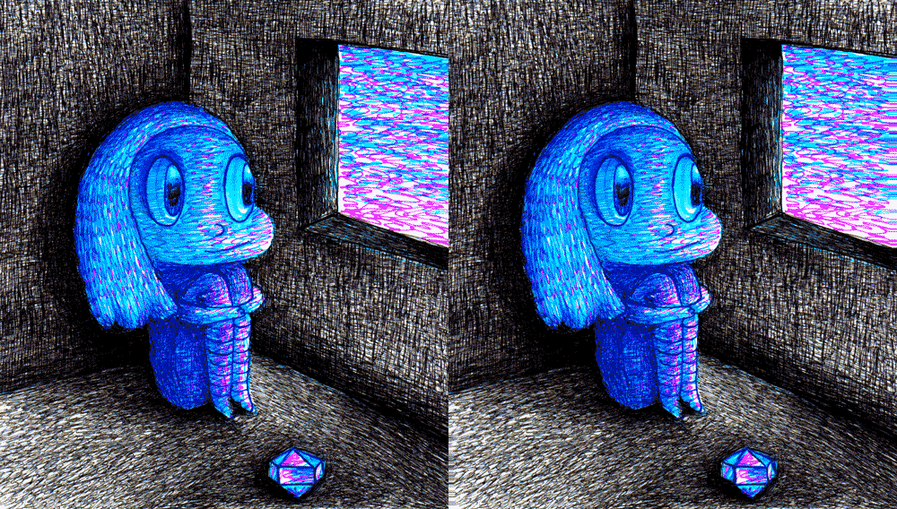
Seattle-based illustrator Dain Fagerholm has blessed the world with what he calls his “stereographic drawings,” animated GIFs that trick your eyes into seeing a crude 3D effect by quickly switching between two similar images drawn from different perspectives. He’s got a blog that is filled with these shifting images that evoke childhood memories in all of us. I’ve shared some of my favorites in the gallery below. Click here to see the rest of Fagerholm’s collection.