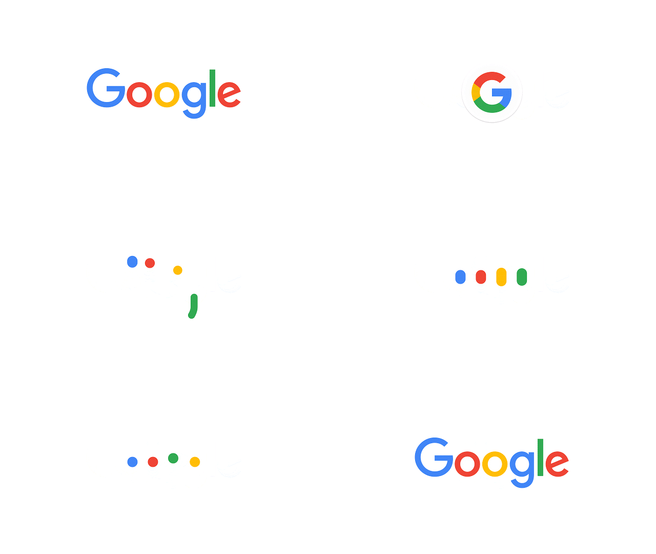
Less than a month after restructuring its company, Google Alphabet (I’m still getting used to it) has gone ahead and “evolved” its most recognizable logo. G is for Google and now that “G” and the name itself “Google” sport brand new, modernized looks as the company embarks on a new chapter of innovations.
Of course, the Google logo has gone through many facelifts over the years, but this has to be the boldest one yet. The classic blue/red/yellow/green color scheme remains, but the typeface has changed quite dramatically featuring an even flatter, more playful aesthetic.
Why now, you ask? Google started as a search engine that could only be accessed on a desktop browser. Today, it has spread to mobile and across a variety of apps including Maps and Chrome and even a full-fledged operating system in Android. The company aims to streamline its branding across its many services, and the new logo allows it to do just that.
The logo is a transformative entity this time around. In addition to the traditional logo featured on the search engine’s homepage, there are the four colored dots, “a dynamic distillation of the logotype for interactive, assistive, and transitional moments.” Hop onto your mobile device and make a voice search; you’ll notice the microphone icon is multicolored now, and when Google’s thinking you’ll see the colored dots bounce around. Last, there’s the new and improved letter G, “a compact version of the Google logo that works in small contexts.” It too is multicolored to match the logo, and you’ll see it presented in app-appropriate shades within Google Maps, Google Translate, and all the rest. The lowercase little blue “g” icon is no more.
Alphabet describes its new Google logo as “simple, uncluttered, colorful, friendly.” Though it’ll take time to get used to its new look, it’s hard to deny that those descriptors make it work. I’m all for modernization, streamlining, and simplicity, so from where I’m sitting, it’s a welcome rebranding indeed.
Interested in learning more about the design techniques that went into producing the new Google logo? Head over to Google’s Design blog for additional details. Oh and jump after the break for an historical look at the famous logo.
[Via Google]