Category Archives: Design

$100 bill gets a makeover

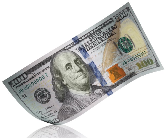
On Wednesday officials unveiled a new design for the $100 bill.  Mr. Franklin joins pals Lincoln, Hamilton, Jackson, and Grant in the fight against counterfeiters.  The new $100 note includes the following security enhancements: A 3D Security Ribbon that nearly cuts the bill in half at the center contains images of bells and 100s that move and change from one to the other as you tilt the note.  The ribbon is woven into the paper, not printed on it.  The Bell in the Inkwell, located on the front of the bill to the right of Franklin, changes color from copper to green when the note is tilted, an effect that makes it seem to appear and disappear within the copper inkwell.  On the back there’s a new vignette of Independence Hall featuring the rear, rather than the front, of the building.  The Franklin portrait and the vignette have been enlarged and the oval around them has been removed.  Also on the back you’ll find a large gold 100; it helps those with visual impairments to distinguish the denomination.  The bill retains several enhancements from the last update including the portrait watermark, the security thread, and the color-shifting 100.  The new $100 notes will begin circulating on February 10, 2011.  Look in the gallery below to learn more about the visual security enhancements; after the break there’s a short animation that highlights the bill.    Welcome to the club, Franklin.  Washington, where you at?

[Via NewMoney]

Continue reading $100 bill gets a makeover

A “green” chandelier comes in many colors

I Saloni, Salone del Mobile, Milano, Milan Salone 2010, Salone 2010, Milan Design Week, Milan Design Fair, Bottleformball by Heath Nash, recycled materials, pet plastic lamp, green design

Bottleformball, designed by Heath Nash.

The colorful ball of chaos you see above is actually a chandelier made entirely of recycled PET bottles.  They are bundled together by a supportive wire structre.  South African designer Heath Nash is one of many that came together at the Misael Gallery in Milan to construct and exhibit “modern ecological designs” made from recyclable material.  The designers “redream paradise by reusing industrial materials to recreate natural or organic objects.”  Take a closer look at the “Bottleformball” in the gallery below.

[Via Inhabitat; Gizmodo]

Could a Hollywood Sign Hotel be in the works?


Danish architect Christian Bay-Jorgensen wants to make it happen.  Here’s the scoop: About two years ago the land that the famous Hollywood sign sits on went up for sale about two years ago.  The non-profit Trust for Public Land is trying to save up enough money to buy the land and save it from being sold to real estate developers.  I understand where the sign supporters are coming from; as Bay-Jorgensen puts it, “I know people are scared.  I know they are afraid this idea will turn it into Disneyland.”  However, it’s no secret that the Hollywood sign isn’t at all what it’s cracked up to be.  It’s old, tiny, and has simply lost its shine since it was introduced in the 1920s.  It’s time for a change, and turning the sign into a bigger and more expansive hotel is an intriguing possibility.  If given the opportunity, Bay-Jorgensen would turn it into a boutique hotel, doubling the size of the sign.  He explains: “…when tourists from other countries come to see the sign, they imagine a majestic structure.  Instead, they see plywood and white paint.  This area should be more public.  I think this could be something that could improve the experience of the LA resident, to let them see the sign in a new way.”  I couldn’t agree more.

The sign supporters have been given a 16 day extension to come up with $12.5 million to preserve the land.  If the deadline comes around and they can’t cough up the money, it’s likely we might see Hollywood Sign 2.0, hotel edition sometime in the near future.  Check out some conceptual images of the hotel in the gallery below.

Update: The Hollywood Sign has been “saved” according to the latest reports.  Playboy founder Hugh Hefner donated $900,000 to the non-profit trust that just tried their darndest to keep the sign as it is.  And with that huge chunk o’ money, the $12.5 million total was reached.  And any dreams of a hotel have been crushed.  [Via Stuff.co.nz]

[Via DailyNews; Slashfilm; LATimesBlog; Gizmodo]

Concept: Google Mail envelopes make e-mail physical

google_mail3

Industrial designers Rahul Mahtani & Yofred Moik have imagined a new way to go about emailing.  This is all conceptual thinking, mind you, but take a knee and listen here.  Google Mail Envelopes is designed to be built into the Gmail service.  When you’re ready to send off an email, you’ll be given two options: send email (as usual) or “send envelope.”  When you click the new button, Google representatives are notified and they print out your email, package it into a Google Maps decorated envelope, and send it off to its destination via the United States Postal Service for a small fee.  The envelope design is neat; the return address and destination labels are placed inside Maps bubbles and they each point to their respective locations on the map.  The two locations are connected by a line, the same line that’s formed when you look for directions online at Google Maps.  In other words, the mail’s exact route is labled on the map on the envelope.  Although this concept is one that will likely never make it into reality (privacy concerns, Google employing letter senders), the idea is quite fascinating.  Turning electronic mail into a physical letter is an option some people might find useful.  It’d be a faster, more efficient way to send a letter–it would eliminate the need to shop for stamps, for one thing.

[Via YankoDesign]

DJ transforms Nike running shoes into musical instruments

DJ Daito Manabe was hired by Nike to create this viral video to promote Nike’s new Free Run+ running shoes.  Daito and crew effectively turned the shoes into controllers and used them to create slick beats and alter sounds by tapping, bending, and twisting them in all sorts of ways.  How’d they do it?  In an interview Daito said “he used flex sensors and accelerometers to make the shoes interactive.  He then processed the control signal and converted it to sound using the modular visual programming environment Max/MSP and Ableton’s Max for Live.”  The result is what you see in the video above.  Freakin’ awesome.

[Via CreateDigitalMusic; Engadget]

Pixels take over NYC in visually spectacular fashion

PIXELS, produced by Patrick Jean at OneMoreProd.

This video is really making the rounds all over the Internet.  And deservedly so.  In PIXELS, New York City gets taken over by 8-bit pixels that come in the form of classic retro video games like Pacman, Space Invaders, and Donkey Kong.  The amazing visual effects combined with Naïve New Beaters “L.A. trumpets” music makes PIXELS one of the coolest animated videos I’ve seen in a while.

[Via Walyou]

Art exhibit plays around with your sense of perception

Feeling Are Facts, designed by Danish-Icelandic artist Olafur Eliasson and Chinese architect Ma Yansong.

“Feeling Are Facts” is an art exhibition located at the Ullens Center for Contemporary Art in Beijing.  Eliasson and Yansong created a disorienting environment inside an art gallery using artifically produced colored fog, a lowering ceiling, and a sloping floor.  Walking through this exhibit must be challenging and exciting as it forces you to question and reinvent new modes of perception.

[Via DesignBoom; Gizmodo]

Lost case mod is detailed to fandom perfection

A bunch of Brazillian Losties have gone ahead and created this awesome Lost mod case.  The amount of detail is tremendous, really.  The PC case is octagonal shaped, a la the Dharma Initiative logo; it has a green and is decorated in a jungle theme; it’s got the 1977 Dharma Initiative team photo stored inside, along with plastic tubes and other instricases; and there’s even a video screen on the outside that plays loops of Dr. Marvin Candle/Pierre Chang’s Dharma orientation films.  The only thing that’s missing is the requirement to type in The Numbers every 108 minutes to save the world from destruction by an electromagnetic force.  Take a closer look at this beauty in the gallery below.

[Via Gizmodo; Flickr]

Meet pCubee, a personal, interactive cubic display

pCubee is a research project designed at the University of British Columbia.

We have designed a personal cubic display that offers novel interaction techniques for static and dynamic 3D content. We arrange five small LCD panels into a box shape that is light and compact enough to be handheld. The display uses head-coupled perspective rendering and a real-time physics simulation engine to establish an interaction metaphor of having real objects inside a physical box that a user can hold and manipulate. We have demonstrated four types of interaction techniques with pCubee: viewing a static scene, navigating through a large landscape, playing with colliding objects inside a box, and stylus-based manipulation of objects.

I think the Nintendo 3DS has met its competition in pCubee.  If they’d just make a slot for game cartridges, I can totally see something like this becoming a viable portable gaming device.  Can’t you?

[Via University of British Columbia]

Concept watch relays Facebook, Twitter updates to your wrist

The stainless steel Instant Trend concept watch receives Facebook and Twitter notifications by hooking up to your smartphone via Bluetooth.   Buttons on the side of the watch let you scan through the messages.  And if you think that’s neat, listen to how bizarre reading the actual time is: the pixelated bars you see in the image above represent the time in hours, minutes, and 10-minute blocks.  “Reading the time is simple, just add the blocks; 12 blocks for hours, 5 blocks for groups of 10 minutes and single minutes 1-9.”  Did I mention this is a concept device?

[Via TokyoFlash; Gizmodo]

Creative explosion of live objects & animation

Lautlos, by Feedmee Design.

Staying true to the ideals of creativity and innovation, with a theme of “Truth vs. Deception”, 20 directors came together to create a ground-breaking collection of short films that use live-action, effects, animation, comedy, action and verité. Twenty 120 remains dedicated to the definition of creative – an original product of human invention or artistic imagination – by celebrating the work of artists around the world.